Marketeq Digital: Admin Panel
UX Research and Design
- Role
- UX Designer
- Scope
- Competitive analysis, card sorting, user flows, wireframes, interaction design, prototyping
- Company
- Marketeq Digital
- Tools
- Figma, Figjam
- Timeframe
- May 2023 - September 2023
Project Overview
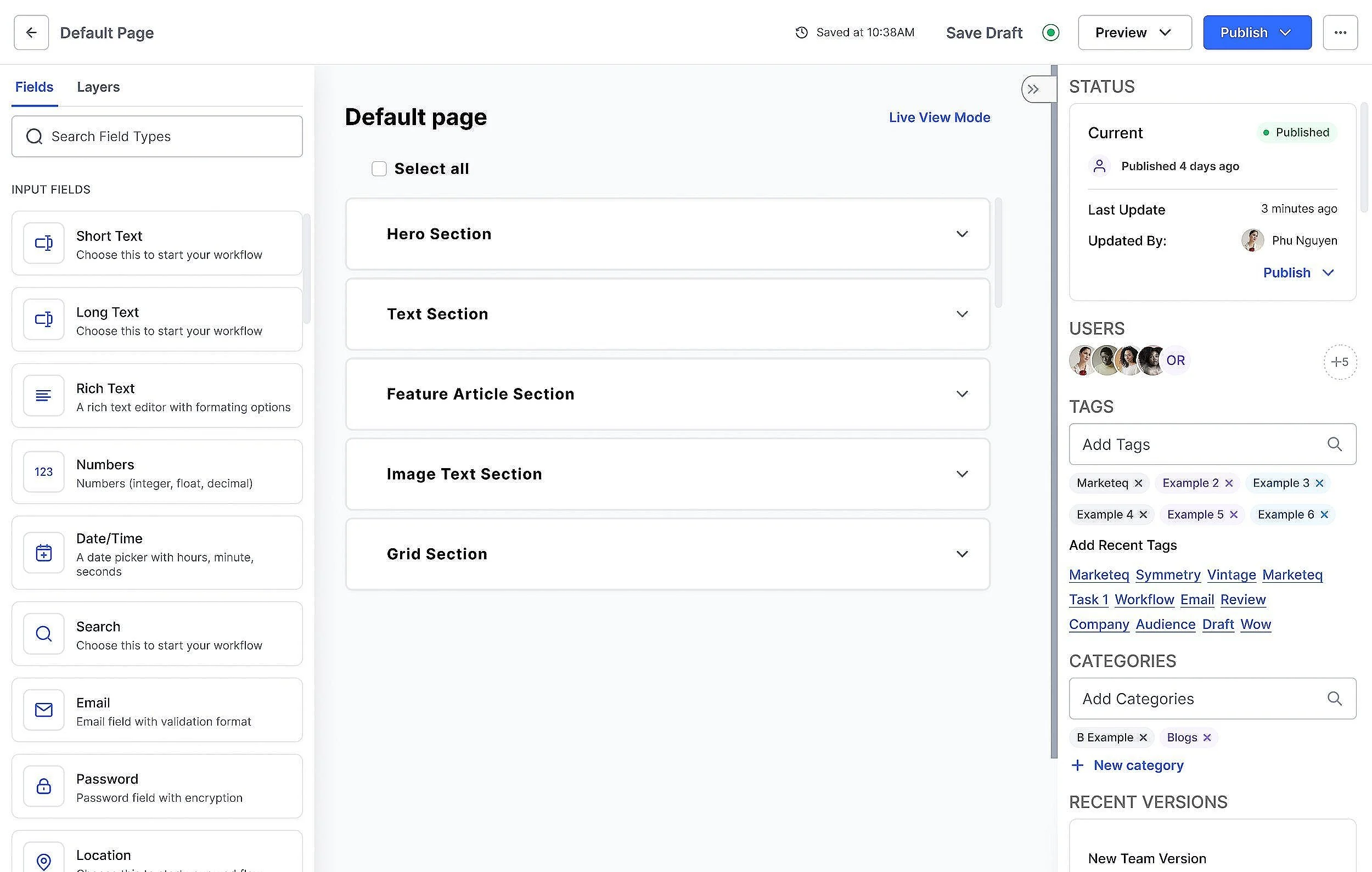
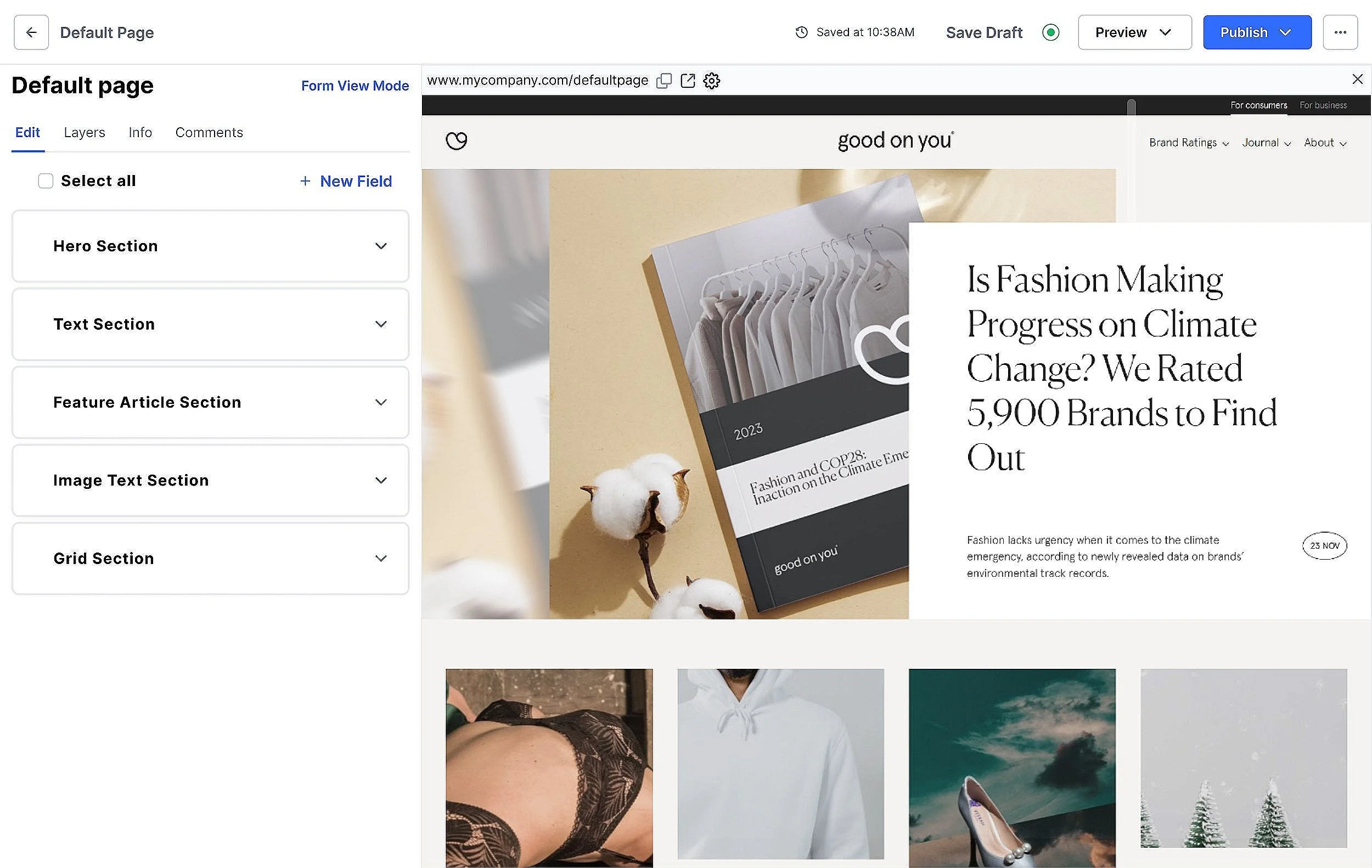
Marketeq Digital is a headless CMS built around customization. Its promise is that people can build API integrations, extensions, and websites without needing a programmer.
As a UX designer, I worked with the senior designer and the CEO to design the foundation of the admin panel, the place where editors manage all of that content. I did the research, user flows, wireframes, and prototypes, and carried it through to high-fidelity screens.
Challenges and Goal
Challenge
A headless CMS is only as good as its admin panel. Marketeq needed one that content editors could use without technical knowledge: managing content, previewing changes, and publishing without getting lost.
Goal
Design an admin panel that keeps routine tasks quick, shows the right controls at the right time, and is built from components the team could keep building on.
Defining the Process
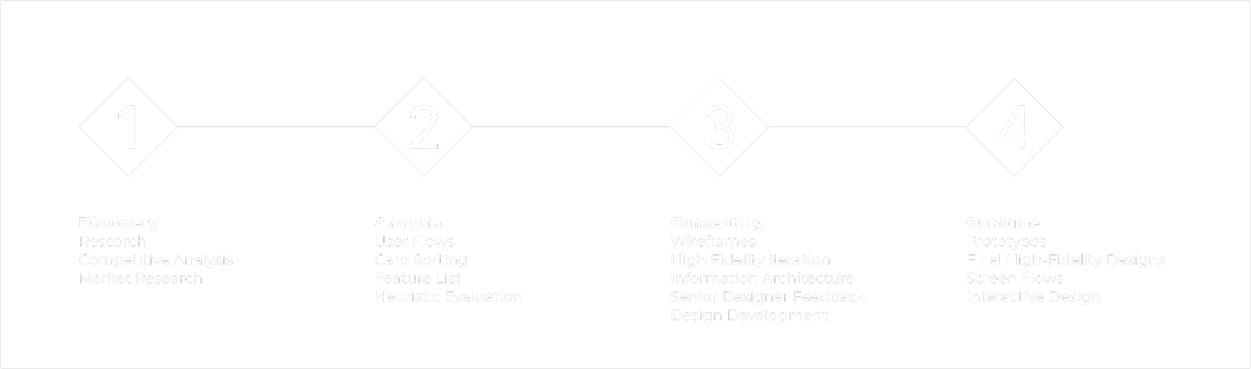
The sprint was big, so the CEO and I split it into four phases. That let me focus on one thing at a time instead of trying to solve everything at once.
Discovery
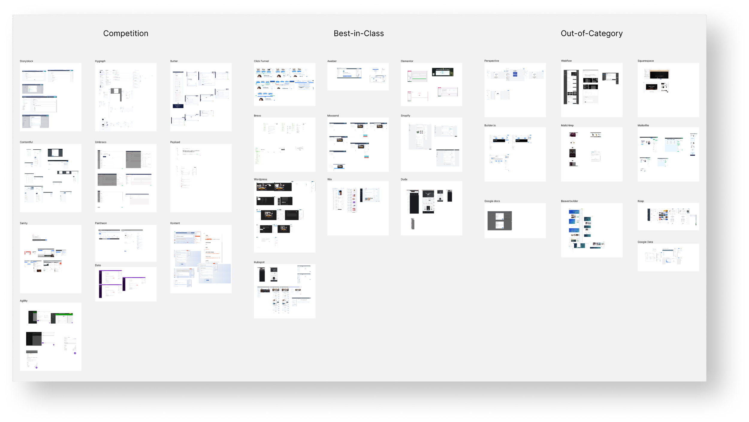
I started by collecting products to learn what makes a good headless CMS, sorted into three groups:
- Competition:
- Headless CMS’s
- Best-in-Class:
- Website builders
- Out-of-Category:
- Non-related but with inspirational aspects
Analysis
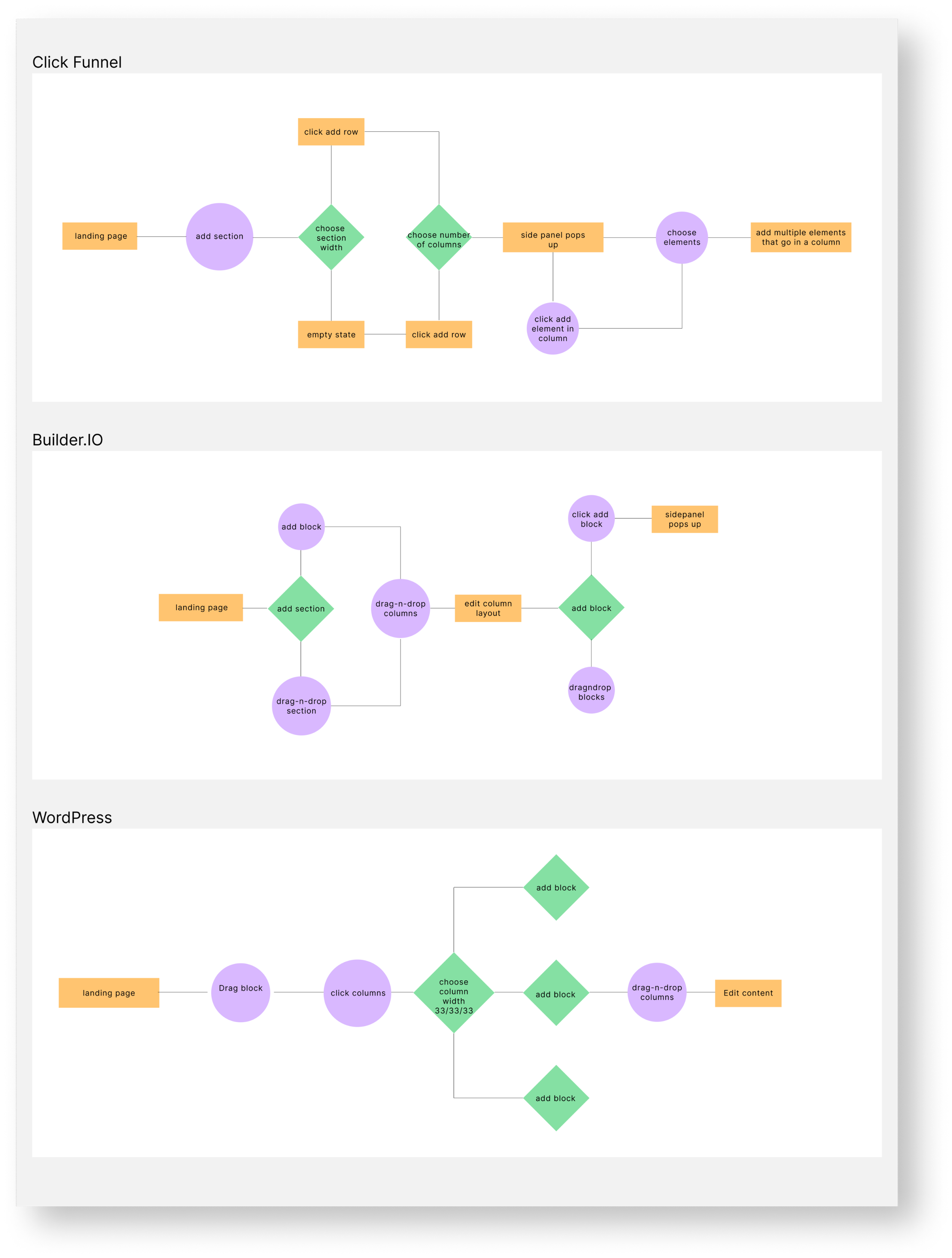
With 10 examples in each group, I ran a card sort and mapped user flows. It gave me a clear picture of what each product does and how far its features reach.
Annotations and Feature Lists
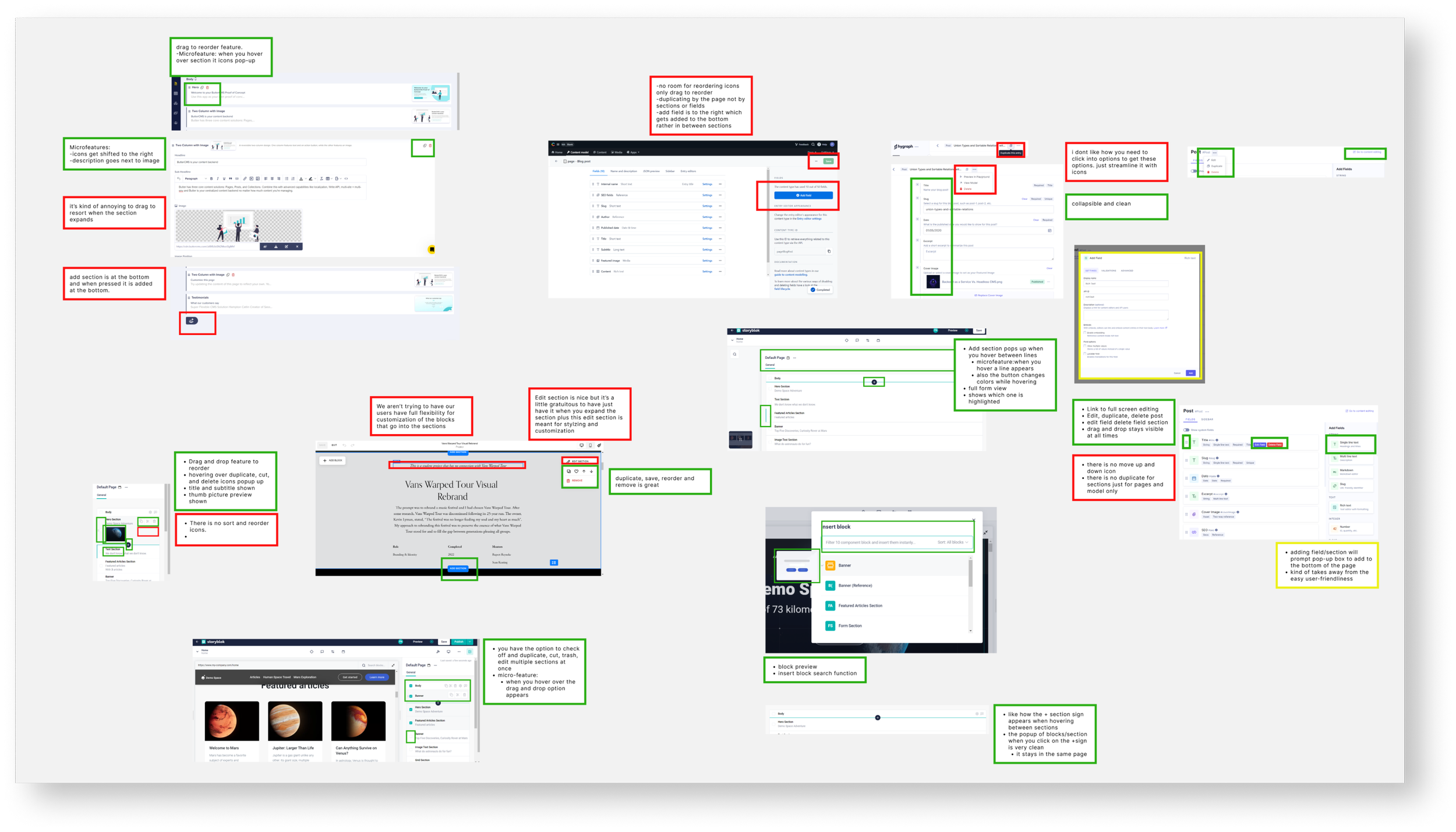
In-Depth Annotations
I annotated every screen in detail, taking each product apart to see what works and what doesn’t.
Feature Lists
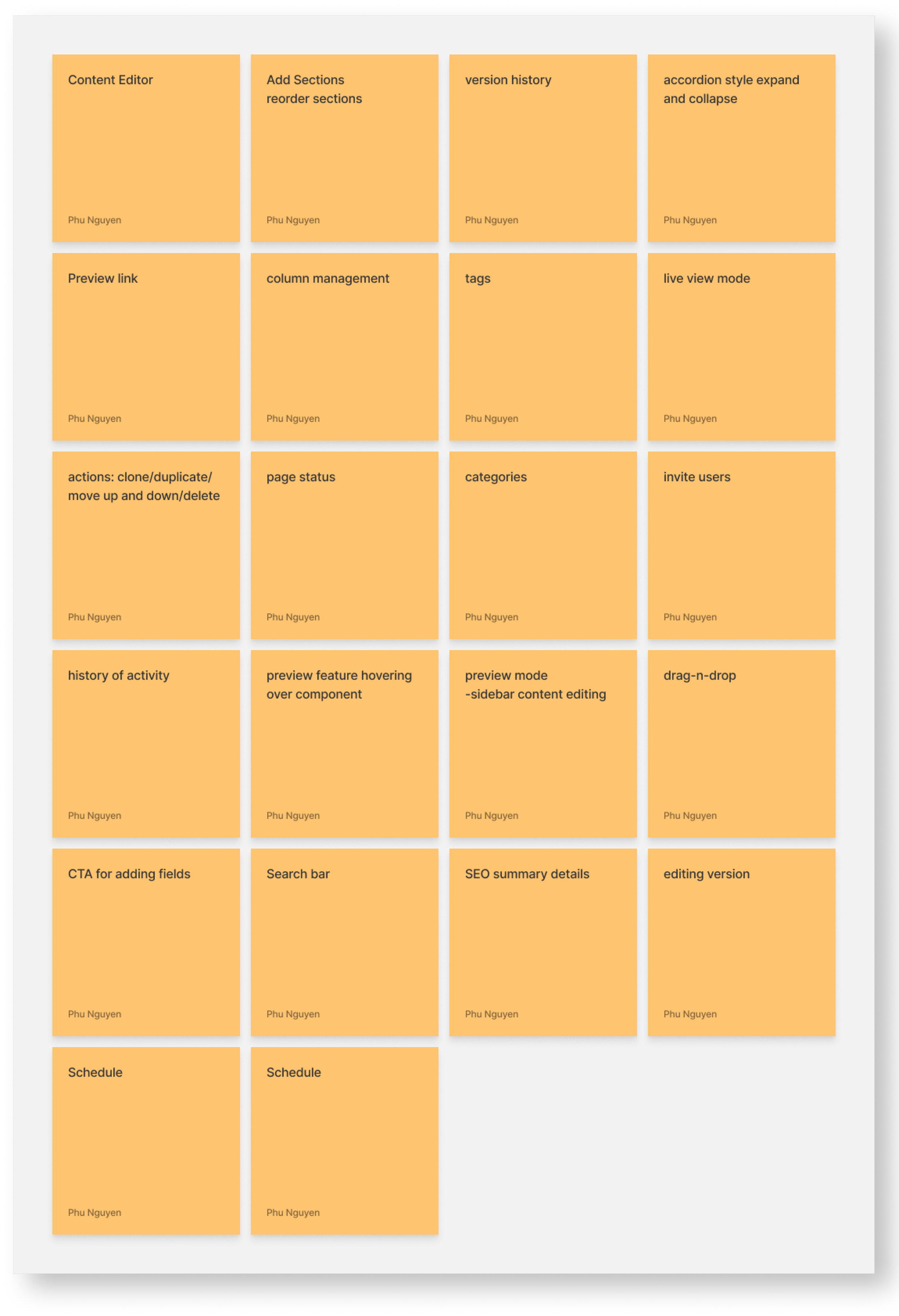
From the research, I sorted features into must-haves, nice-to-haves, and will-not-haves. My senior designer had me use this list to guide every design decision after it.
Must-have: Essential features for basic functionality.
Nice-to-have: Enhancements that contribute to an improved user experience.
Will-not-have: Features deemed confusing, harmful, or detrimental to the user experience.
Must Haves:
- Content editor
- Preview link
- Add sections
- reorder sections
- sidebar panel info
- Accordion style expand/collapse
- Version history
- Invite Users
- Drag and drop
- Live view mode
- Form view mode
Phu Nguyen
Nice to have
- Sidebar content editing
- preview feature hovering over component
- History of activity
- Unlimited section nesting
- CTA for adding fields
- Search bar
Phu Nguyen
Will Not have:
- Building data sets
- SEO summary details
- Scheduling
- Editing version
Phu Nguyen
Concepts and Iterations
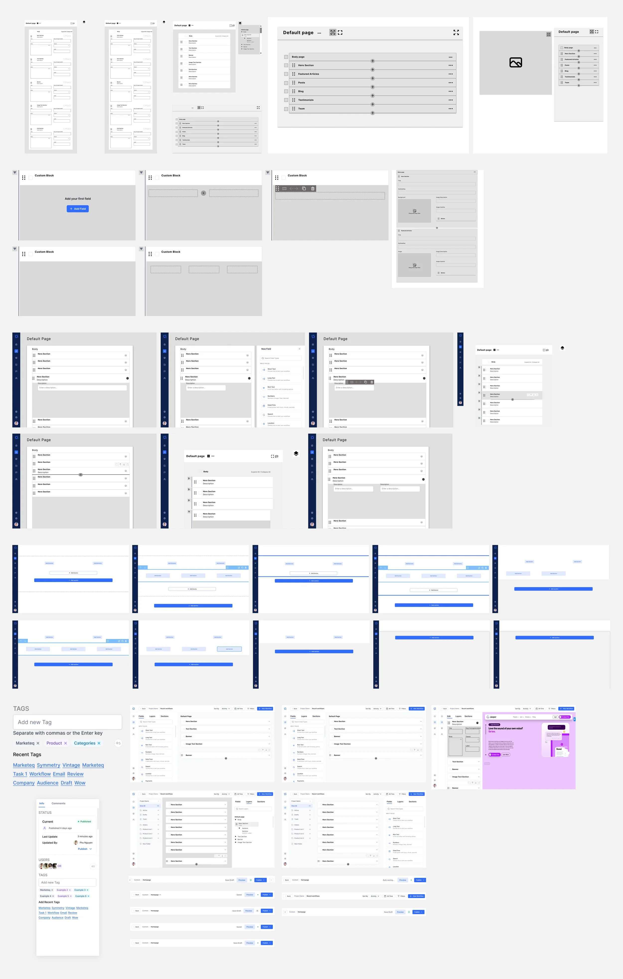
I wireframed one feature at a time, down to its smallest interactions, and went back and forth with my senior designer to narrow in on what suited the product. Once a feature was settled, I added it to the full screen.
Synthesis
Across all three groups, I ran a heuristic evaluation of how each platform organizes content, and noted where some did things better than others. The patterns came from headless CMSs, but a lot of the best ideas came from best-in-class and out-of-category products.
With my mentor’s guidance, I landed on four main features for a working admin panel, and worked through the smaller interactions inside each one so they fit together.
Live View Mode
- Adaptability
- Digital Workspace
- Realtime editing
Content Management
- Adding Fields
- Resizing Fields
- Column Management
- Drag-n-drop Feature
- Interactive Features
- Bulk Actions
Sidebar Panel
- Status
- Users
- Tags
- Categories
- Versions
Topbar Navigation
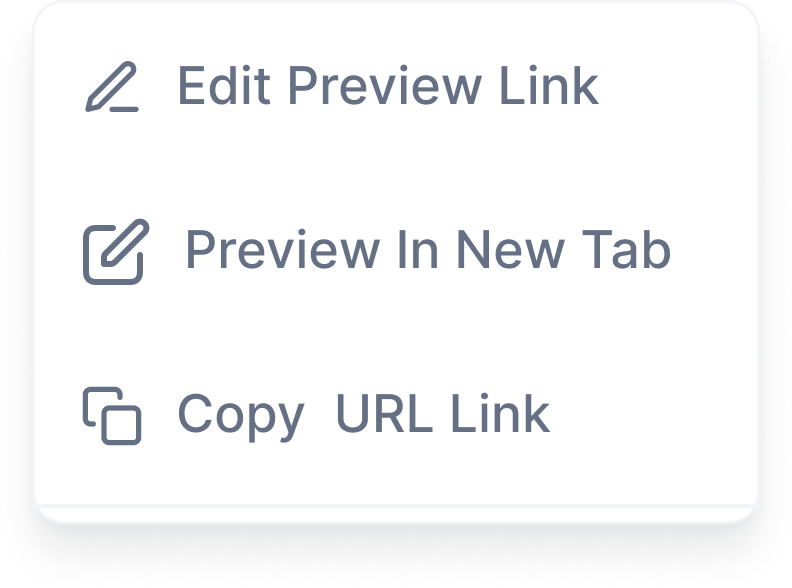
- Preview
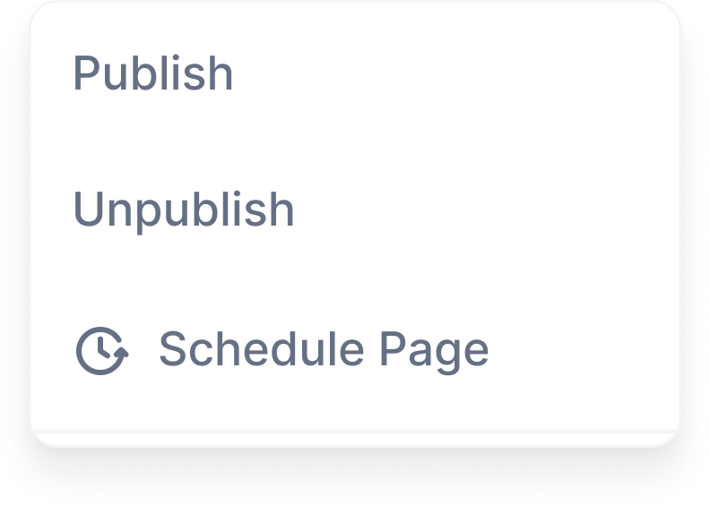
- Publish
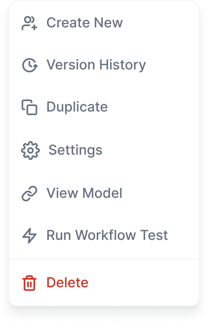
- More Options
- Last Saved
- Status
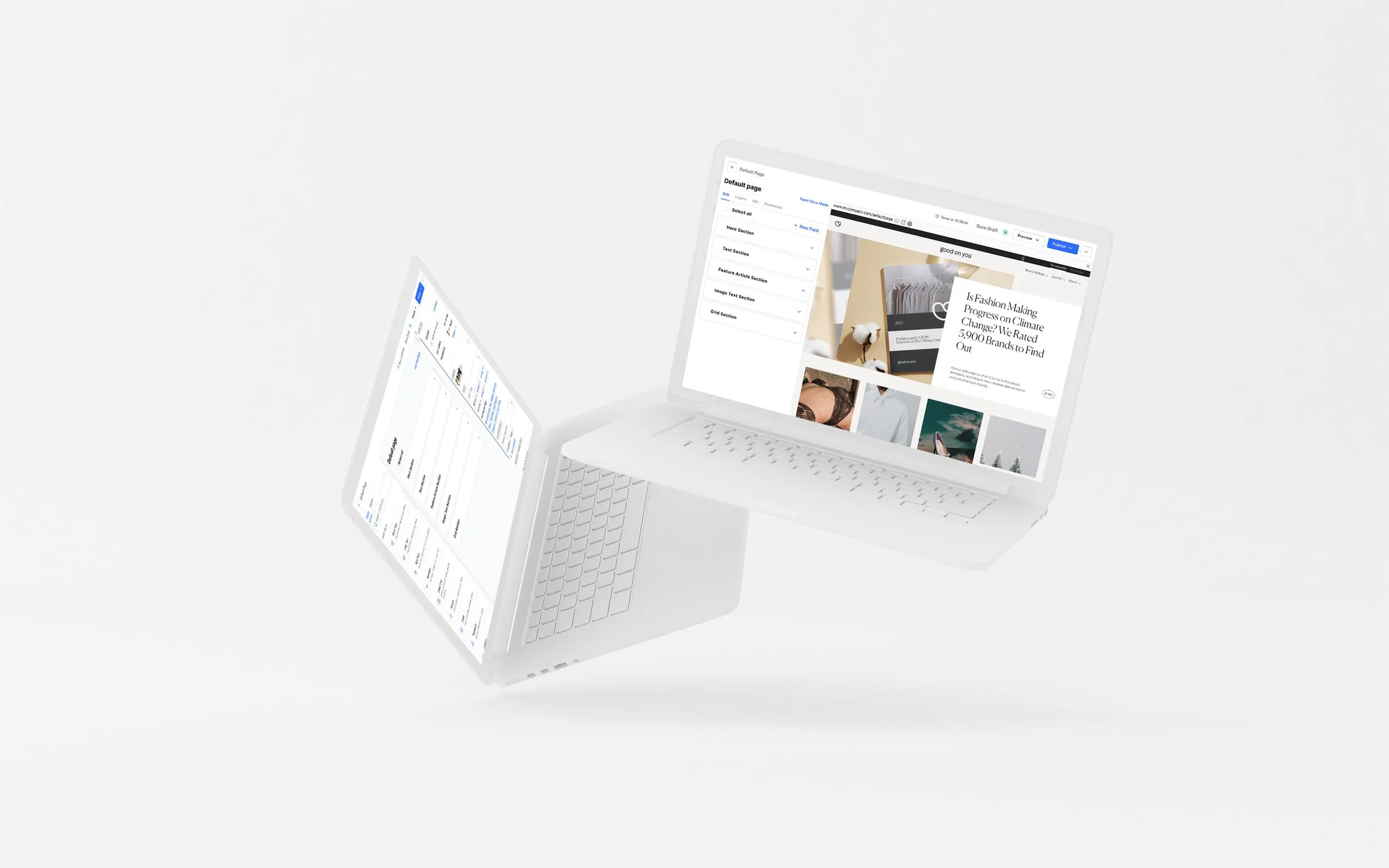
Outcome
With the research and wireframes done, I moved into high-fidelity designs. Because the foundation was solid, this part went smoothly. I checked in with my senior designer throughout to keep the work up to standard.
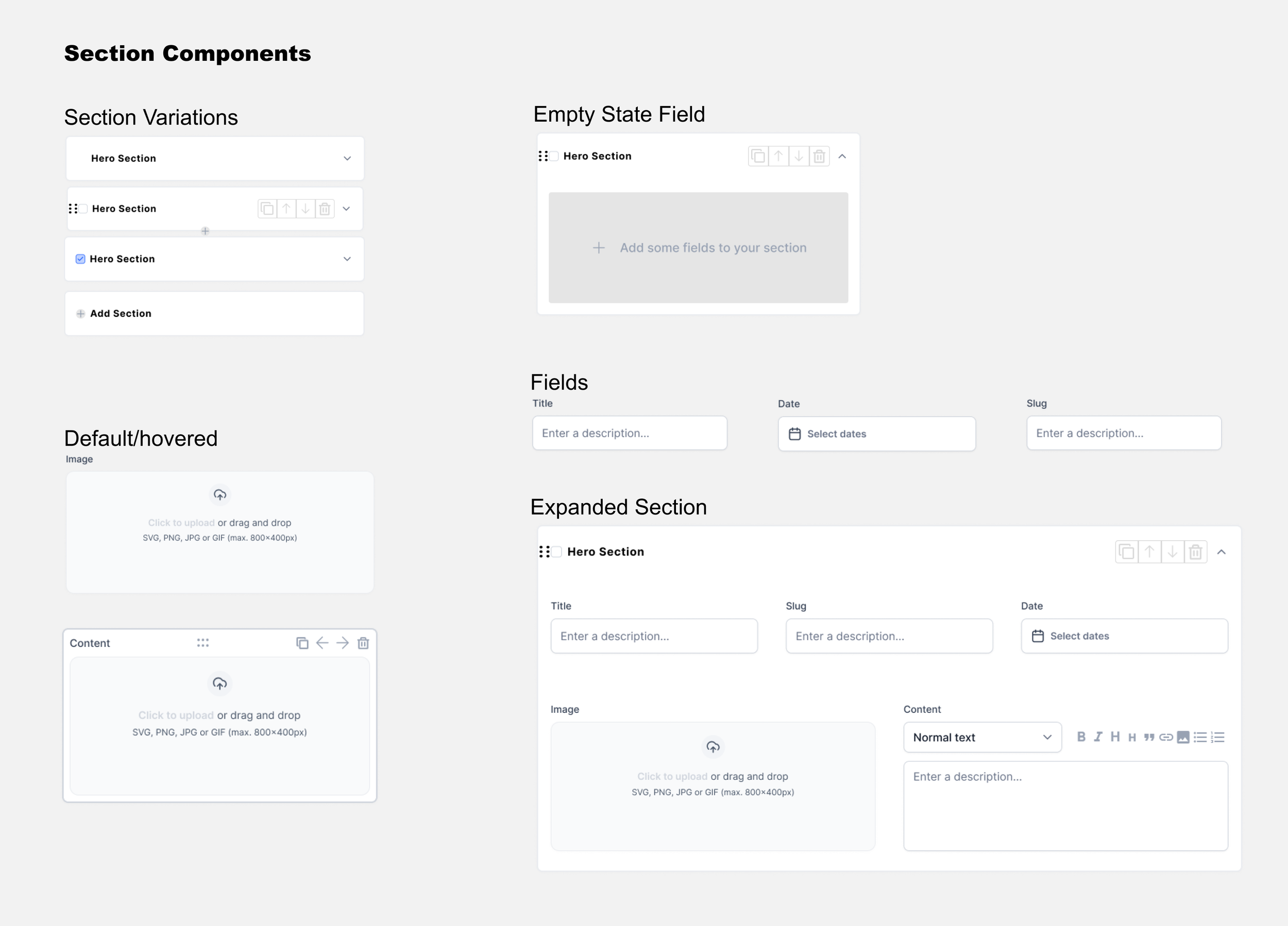
Content Management
Once the basic content management worked, I built out the features from the list. We wanted editors to be able to jump in at any time to edit content or add data to the model, without a separate editing version.
I took the best parts of each headless CMS from the heuristic evaluation, and pulled in ideas from other kinds of platforms too.
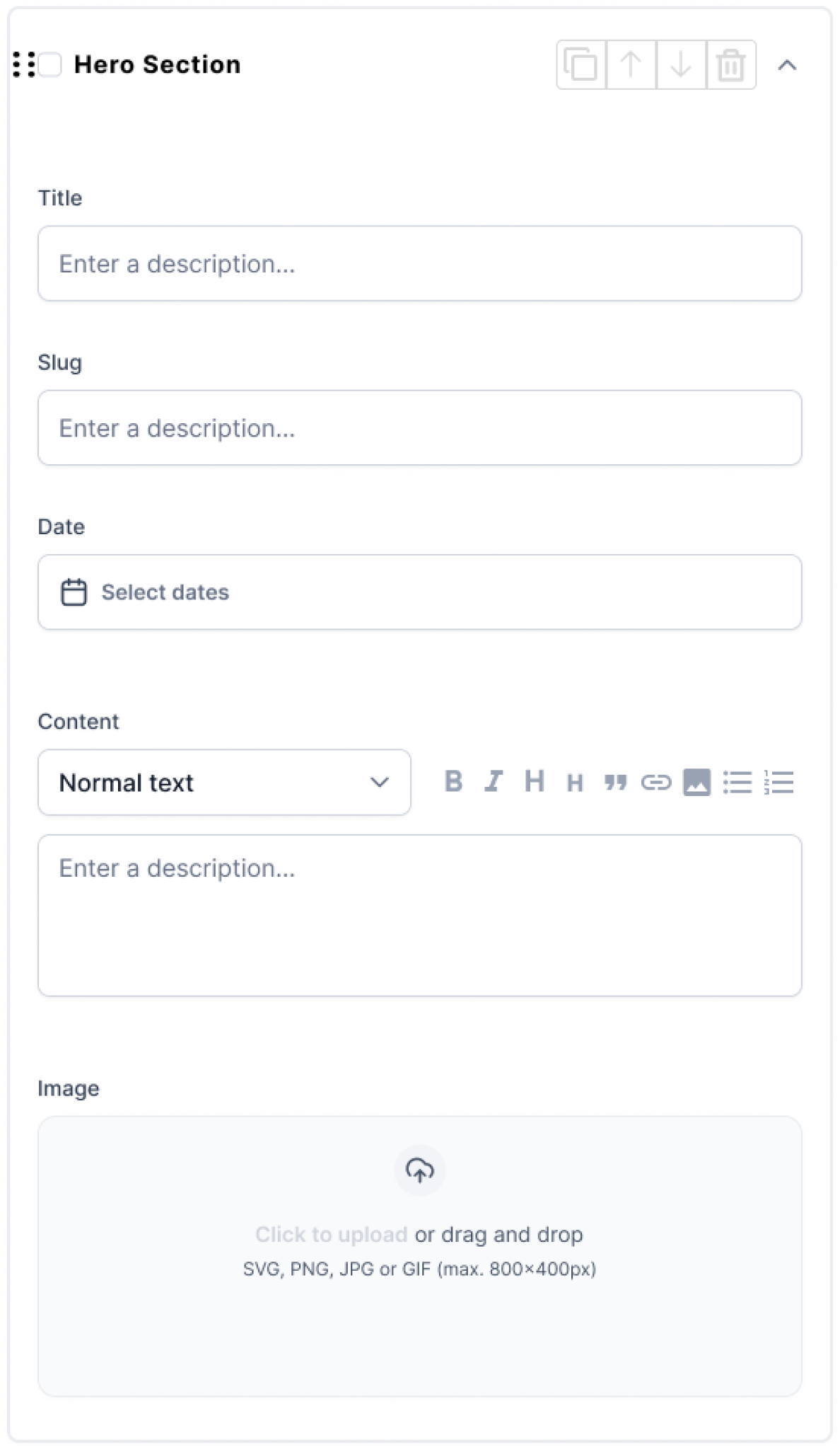
Content Management: Components
These are the core pieces of content management. I listed the small interactions that would make editing easier, then designed components flexible enough to handle them.
- Active states
- Moving between rows and columns
- Quick/Bulk Actions
- Drag and Drop
- Hover States
Sidebar
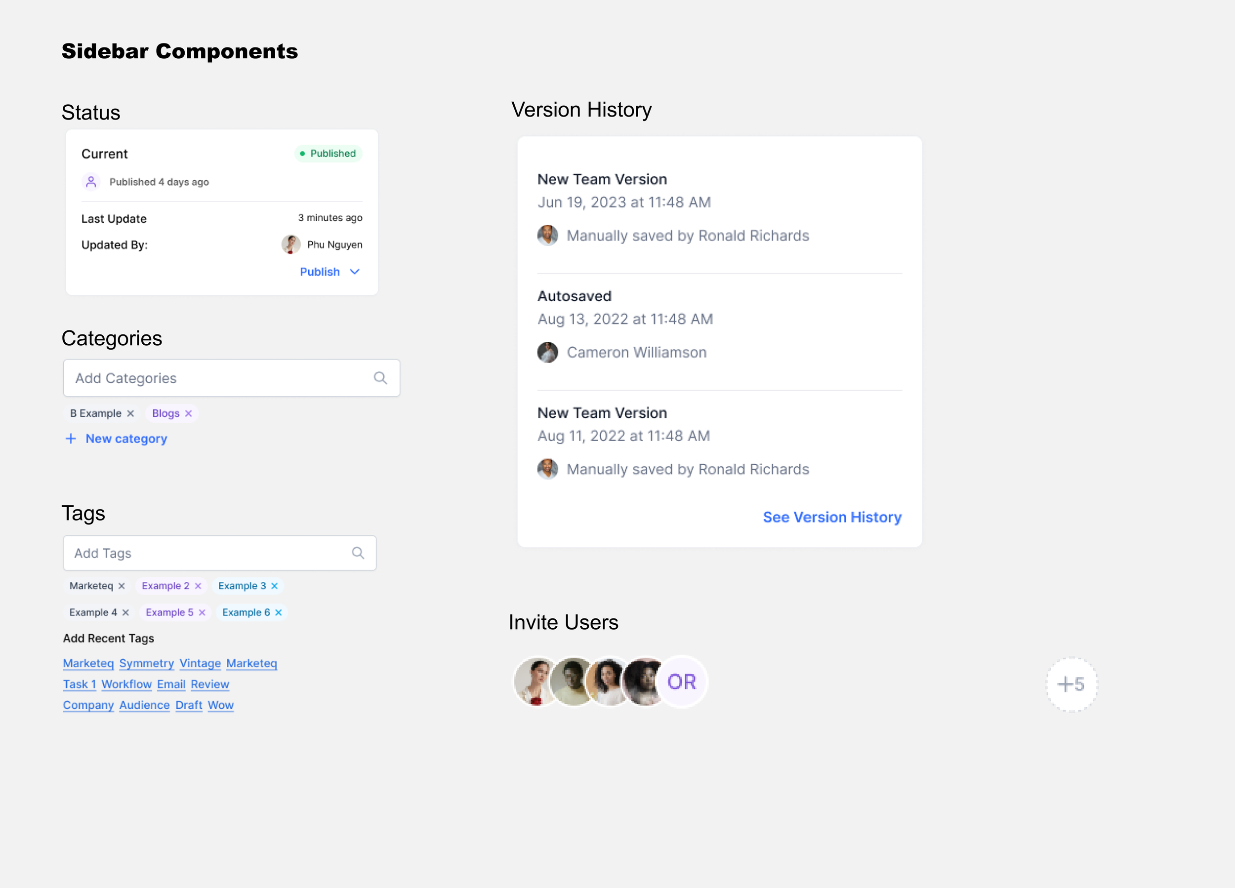
The sidebar is where editors work with a document’s details. I looked at how other platforms handle it, kept what actually helped, and designed it as its own set of components.
Sidebar: Components
The feature list told me what mattered most. I mapped a user flow for each feature and broke it down until I knew what a good sidebar needed.
- Badges
- Autofill
- Publish Status
- Invite Users
- Create Tags
- Add Categories
- View Versions
Live-View Mode
Inspired by other CMSs, and working with my senior designer, I designed a live-view mode so editors can see their changes on the page in real time while they work.
Live-View Mode: Components
In live-view mode, I merged the two sidebars into one to save space and cut down on clutter.
Editors can change content right in the sidebar and switch between its tabs.
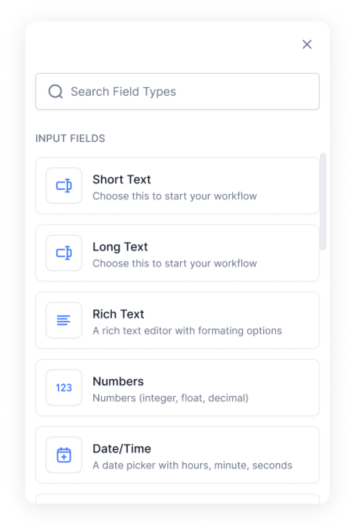
Popup field bar
Space is tight in live view, so adding a field opens a popup instead.
Single Column View
Columns collapse into a single column in live view.
Top Navigation Bar
I studied other platforms’ navigation bars and sorted their features into must-haves, nice-to-haves, and will-not-haves. After a few rounds, my senior designer and I settled on the final design.

Takeaways
Back Every Decision with Research
Design based only on assumptions has nothing to stand on. Don’t reinvent the wheel: get a solid, easy-to-use foundation in place first, then add the extras.
Look Outside the Category
Some of my best ideas came from products that had nothing to do with CMSs. Understanding how a headless CMS differs from a regular one is where the room for new ideas is.
One Step at a Time
A big sprint is easy to get overwhelmed by. Breaking it into steps let me notice the small details in each component, then knock them out one by one.
Looking Ahead
Future Opportunities
With more time on the project, I would have worked through the nice-to-have list. The foundation was solid, but there was more to make better. I also would have loved to watch real editors use the panel and see what the new designs changed for them.
Where It Landed
The project gave Marketeq a strong starting point for its admin panel, grounded in research and familiar patterns, so editors coming from other headless CMSs would feel at home.