← Schema

Design System Work

Designing components and product screens directly in code with AI, and building the Figma systems behind them.

Role
Product Designer
Projects
Retail analytics platform, Open edX Paragon, A&E project tool, Spending Spotlight
Timeframe
Dec 2025 - Aug 2026
Tools
Figma, Claude Code, React + shadcn/ui, GitHub
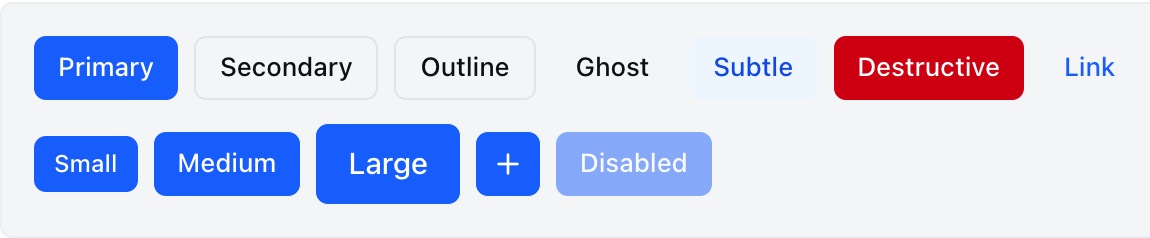
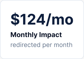
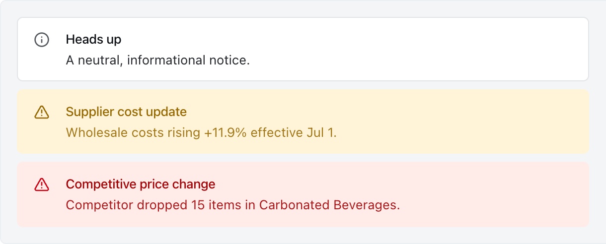
Performance Summary modulePrice Review module with the detail panel openParagon brand and core color scalesSpending Spotlight color tokensA&E tool color systemParagon display type scaleA&E tool data tableCategorical chart color tokensSpending Spotlight type scaleSpending Spotlight company cardChatBubble conversationParagon card componentSpending Spotlight impact donut chartA&E tool toast notificationParagon toast with an actionButton variantsSpending Spotlight monthly impact stat cardA&E tool status pillParagon primary buttonSpending Spotlight green rating badgeAlert variants

A Retail Analytics Platform

The client is a retail pricing and promotions analytics platform. Its modules had been built by different teams at different times, so filters, tables, and layouts behaved differently from screen to screen. In 2026, a three-person Schema team spent twelve weeks building a design system and an interactive prototype on shadcn/ui and React.

Our technical lead set up the repository, the token architecture, and the prototyping workflow. Our senior designer built the data table and filter bar. I designed and built components and product modules inside that system, working in code through AI-assisted design-to-code workflows instead of handing off Figma files.

Weeks, three-person team
12
Components in the system
~55
Prototyped product modules
9
Pull requests I merged
20

Designing by Prompting

This was a new way of working for me. Instead of drawing a component and handing it off, I described it to Claude Code and shaped it until it matched the design intent. Early on, I learned to stop pointing at raw color values and to build on the system’s semantic tokens, so components stay easy to retheme later.

Sketch the Intent

Paper sketches, low-fidelity frames, or a quick tweak in the browser inspector to find the right spacing.

Prompt with Constraints

Describe the component in Claude Code against the system’s rules, using semantic and component tokens instead of raw values.

Document as I Go

Every component ships with a showcase entry covering its variants, states, and where it’s meant to be used.

Review Like Design

Each pull request goes through design and engineering review before it becomes part of the system.

Components I Designed

Over the engagement I contributed about twenty atoms and molecules to the library. Many of them are the small pieces analysts touch constantly: selection controls, status, search, and the building blocks of the AI assistant experience.

MultiSelect

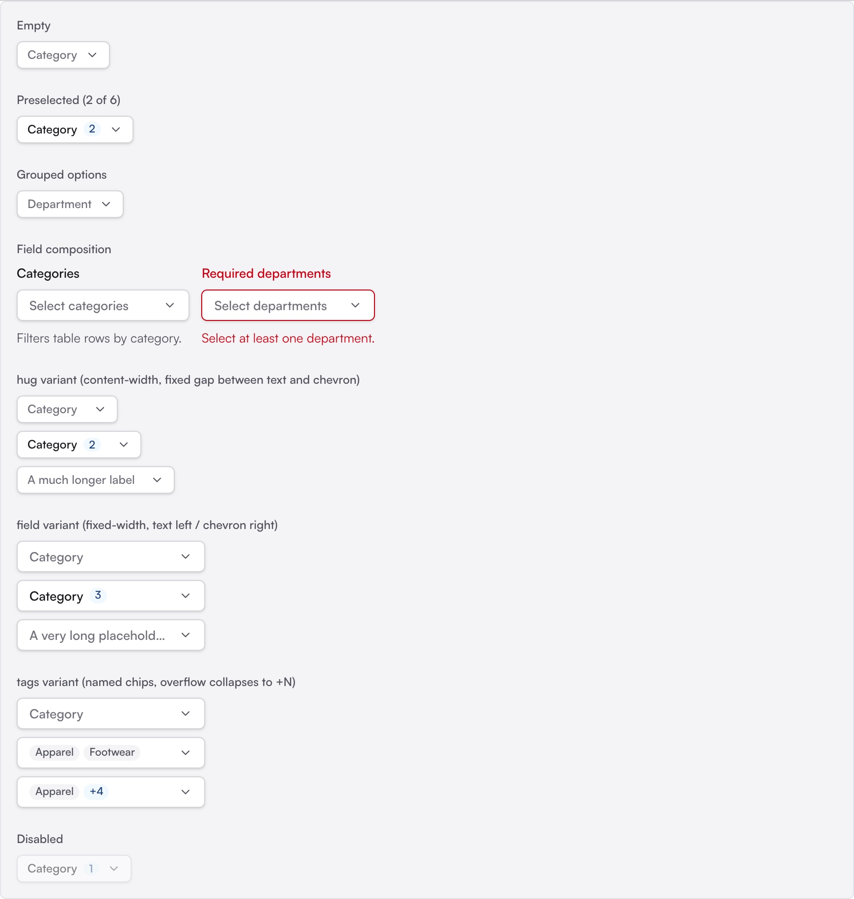
Searchable multi-select with Select All and Clear, plus four trigger variants for filter bars, forms, sidebars, and tag-style chips. Selected items rise to the top when it’s reopened.

ChatBubble

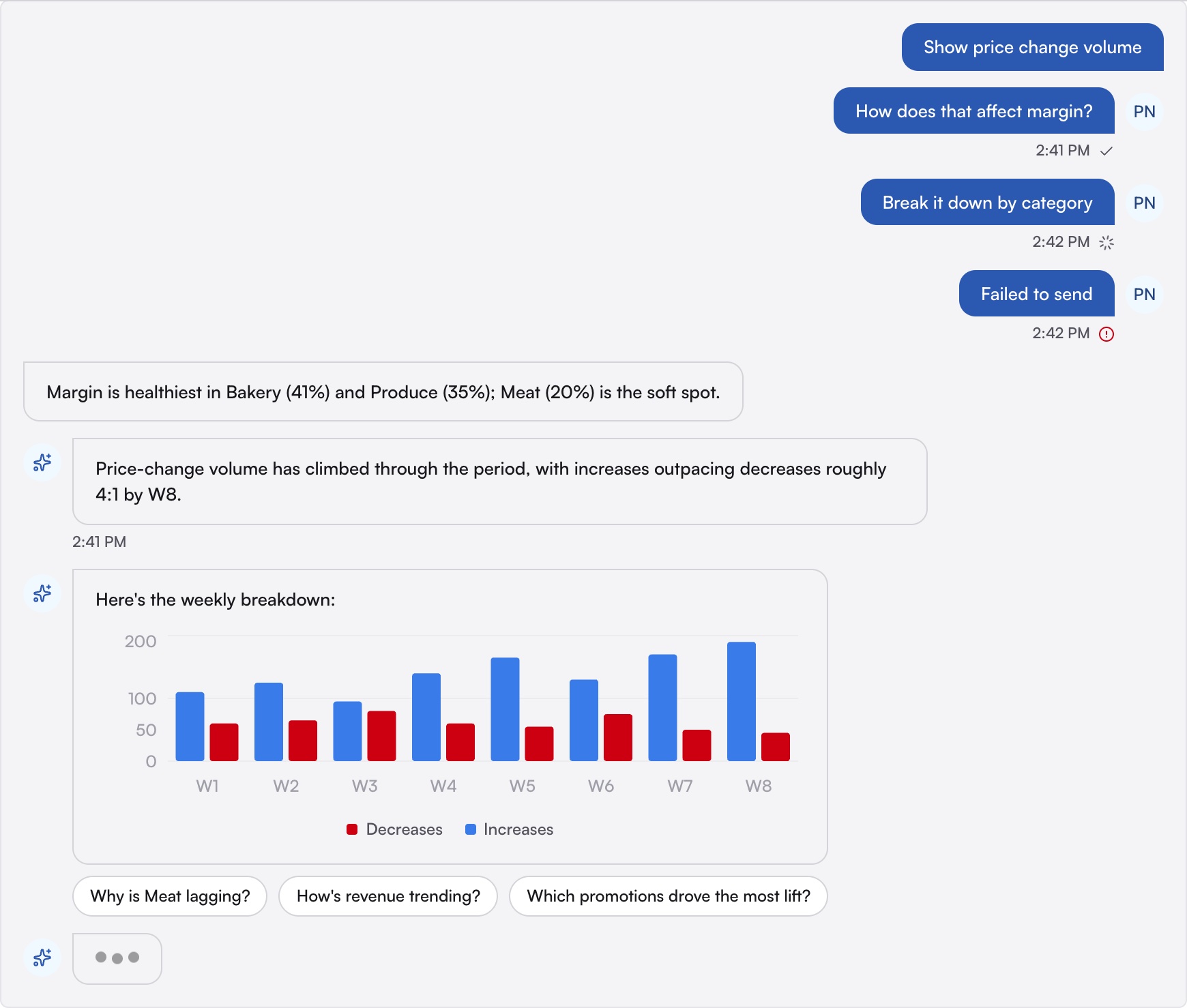
User and assistant message bubbles with delivery-state icons, a typing indicator, and suggested follow-up chips, all styled through their own component tokens.

AgenticSearchBar

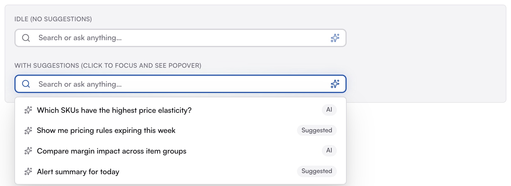
A search input with an AI affordance and a popover of suggested follow-up questions, reused in the assistant chat, home alerts, and the top bar.

StatusPill & SectionHeader

Small, heavily reused patterns that keep status language and section hierarchy consistent across modules.

LabelBreadcrumbRadioGroupGridRadioSelectorComboboxToggleGroupUserAvatarBadge (solid)SheetTabsActivityItemSearchBarBubbleChart
MultiSelect
MultiSelect variants: empty, preselected, grouped, field composition with an error state, hug, field, and tag-chip triggers, and disabled
ChatBubble
ChatBubble conversation with sent, sending, and failed messages, a chart reply, a typing indicator, and follow-up chips
AgenticSearchBar
AgenticSearchBar idle, and focused with its popover of suggested questions

From Brief to AI Chat Components

The client wanted its assistant to feel built into the product, not bolted on as a separate chatbot. I designed the conversation pieces for it: user and assistant bubbles, message states, agentic indicators, and follow-up prompt chips. I started from paper sketches and low-fidelity concepts, then used them to steer Claude as it built each component.

Because every color and radius runs through the chat’s own component tokens, the pieces could be restyled for the new brand without touching their structure. They later became the building blocks of a sales demo that showed off agentic workflows across the product.

#203 · Add ChatBubble · 3 review rounds · approved Jul 8, 2026

What review caught

  1. 01 “--chat-assistant-radius is dead on arrival… re-skinning the assistant bubble silently does nothing.”

    → Both bubbles read their own radius token, so each can be re-skinned.

  2. 02 “Should almost never do styling using JS like this.”

    → Replaced the JS hover styling on the suggestion chips with CSS.

  3. 03 “Pass null to suppress the avatar… there is no working suppress path.”

    → Fixed the avatar guard so the avatar-less state actually renders.

  4. 04 “It embeds another atom (UserAvatar), so… classify it as a molecule?”

    → Reclassified ChatBubble as a molecule.

962af03 Address ChatBubble review feedback
a1346e2 Reclassify ChatBubble as a molecule

The result · ChatBubble
The merged ChatBubble: user and assistant bubbles with sent, sending, and failed states, a chart reply, a typing indicator, and follow-up chips

Review comments from our technical lead on my ChatBubble pull request, trimmed, next to the version that merged.
Prompting is still designing. The quality comes from clear intent, not from the tool.

Modules I Built Out

Once the library was in place, I took on three of the prototype’s product modules. I composed each one from the system’s components, recreated the key workflows from the legacy product, and filled in the gaps with new, reusable pieces.

Pricing

Price Review

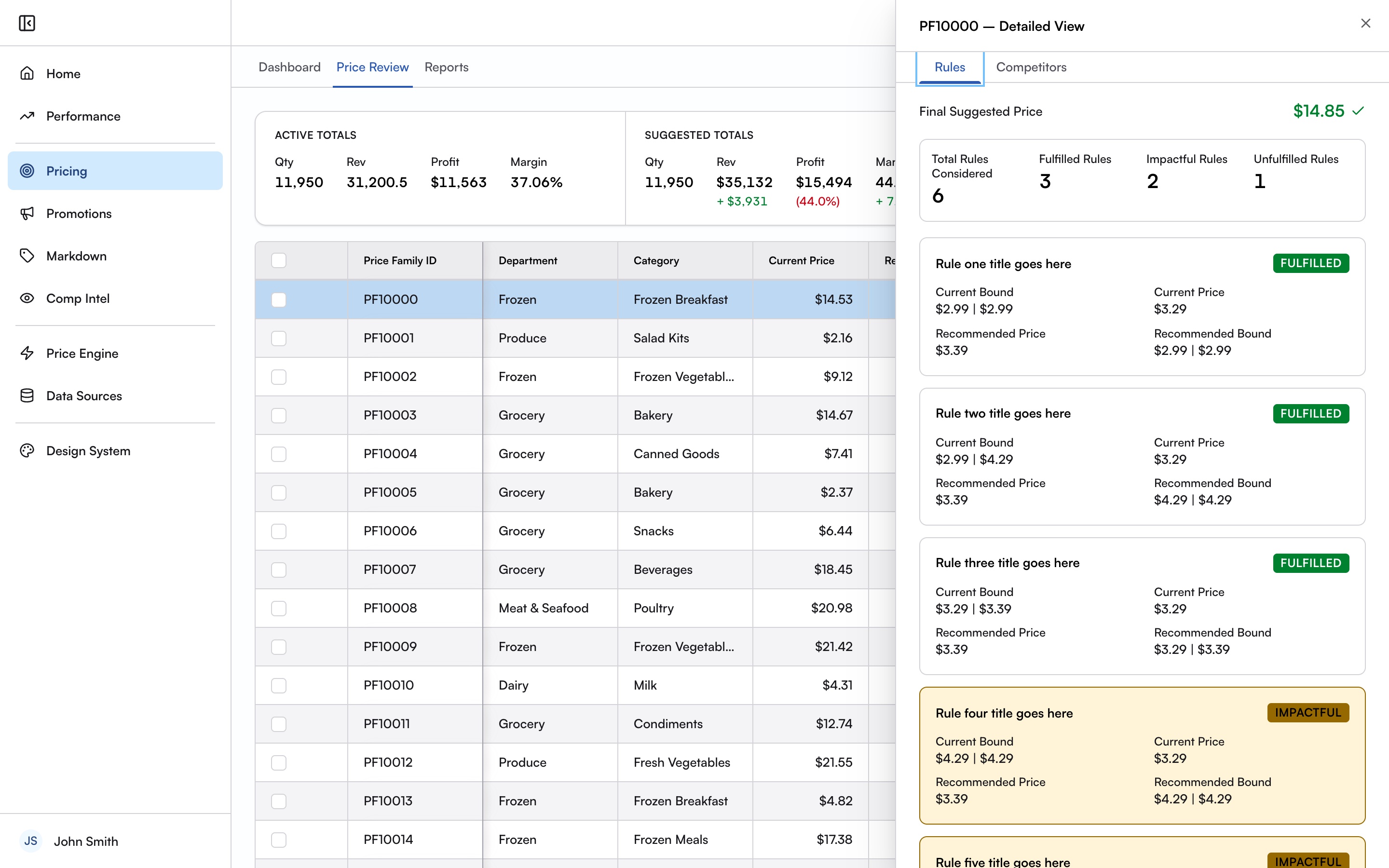
A dense price review table, a slide-over detail panel with rule and competitor tabs, and an active-insights panel showing the most and least impactful changes.

Markdown

Event Detail

An event detail layout with independent scroll zones, sales-velocity and inventory-projection charts, and stage controls for each markdown step.

Performance

Performance Summary

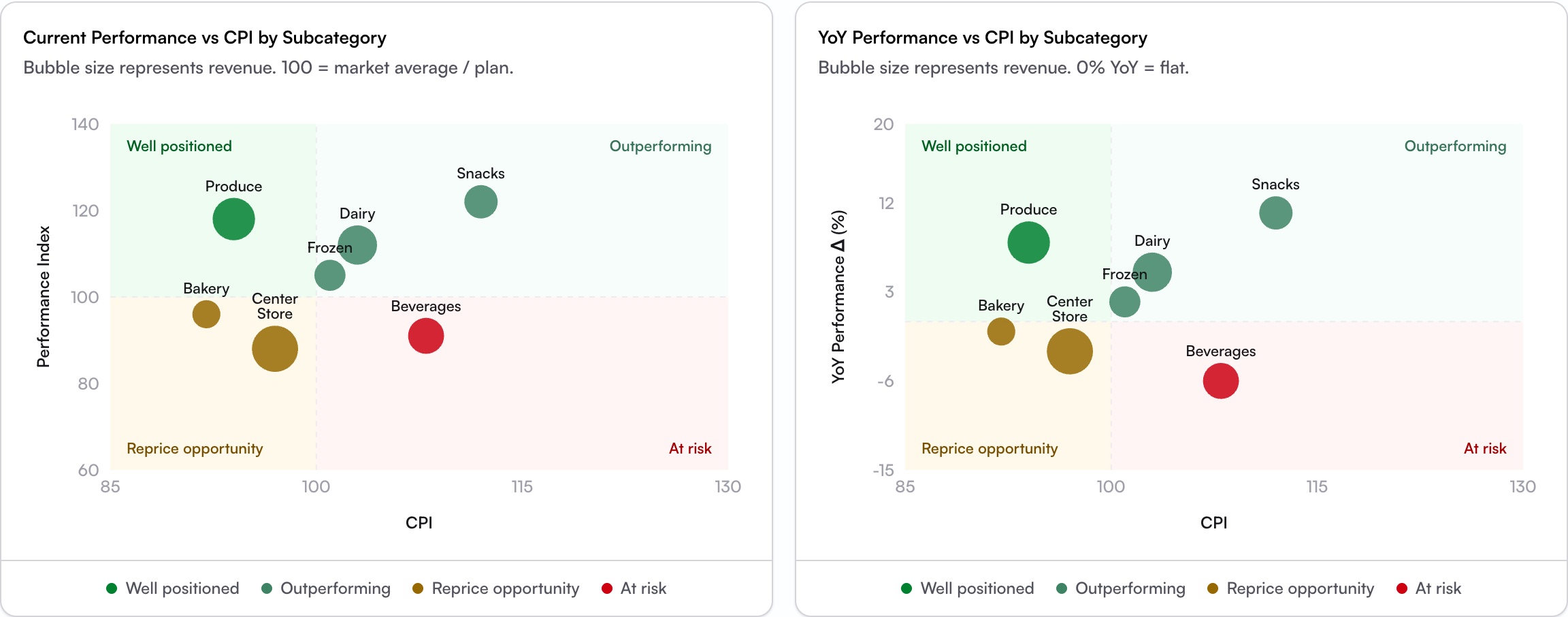
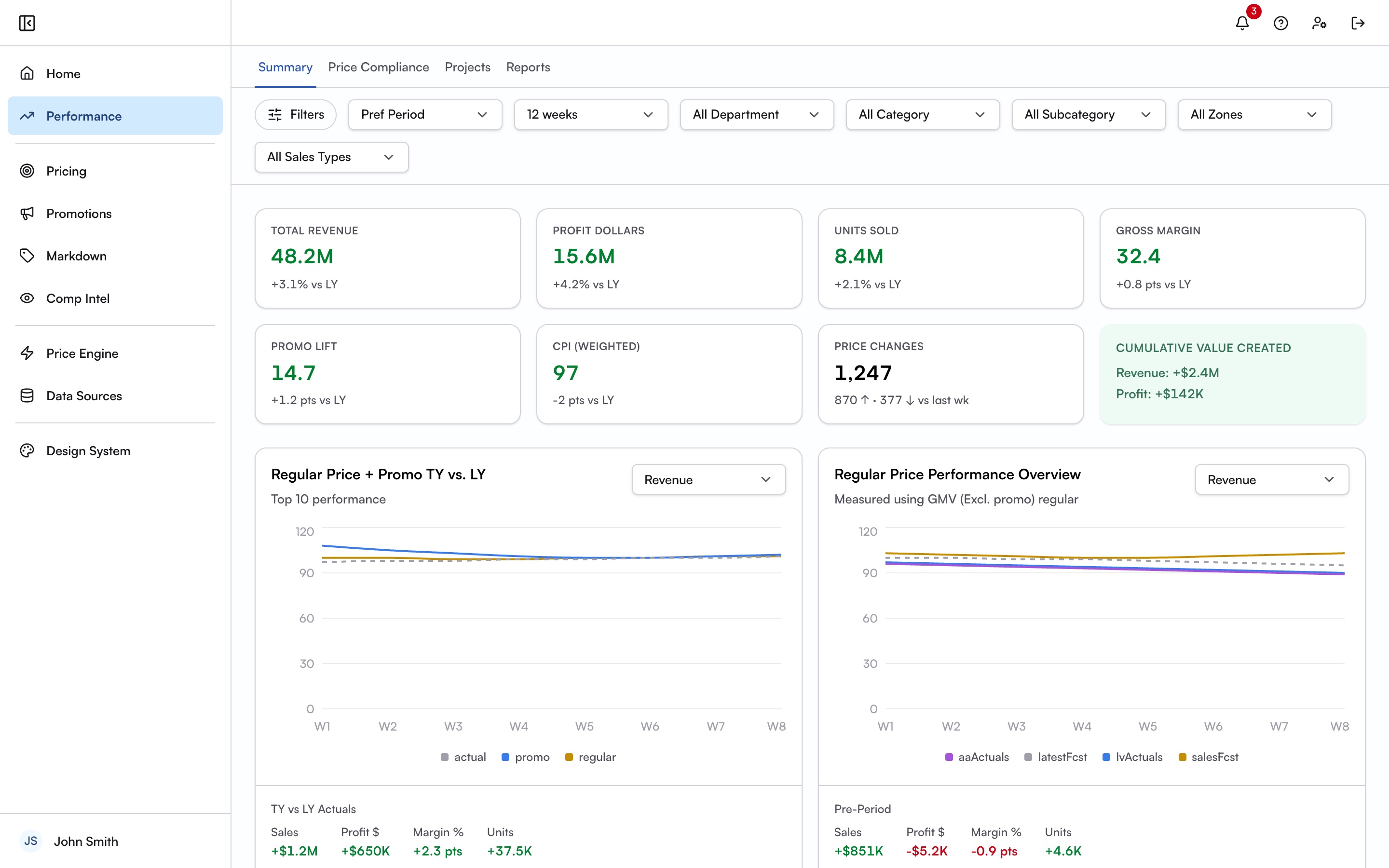
KPI grids, CPI-vs-performance bubble charts, a price-compliance view, and grouped project cards, with the shared filter bar placed across the module.

Performance Summary module: a filter bar, a grid of KPI cards for revenue, profit, units, margin, promo lift, and CPI, and trend charts comparing this year to last
Performance Summary: KPI grid and trend charts. All data is synthetic.
Price Review module: a price table with the detail panel open, showing rule cards marked fulfilled and impactful for the selected price family
Pricing: the review table with the detail panel open.
Performance · CPI vs. performance by subcategory
Two bubble charts plotting performance against CPI by subcategory, with quadrants for well positioned, outperforming, reprice opportunity, and at risk

Quality and Outcome

Building in code made accessibility issues easier to catch. I flagged that the warning badge’s color pairing failed WCAG AA contrast, and fixed focus-ring alignment on inputs and search.

By the end, the team had delivered a system of about 55 components on a three-layer token architecture, nine prototyped product modules, and a workflow the client’s product managers now use to build prototypes on their own. I contributed 20 merged pull requests to that effort.

Across Schema

01 · Open edX · Paragon

Shared Design Collateral

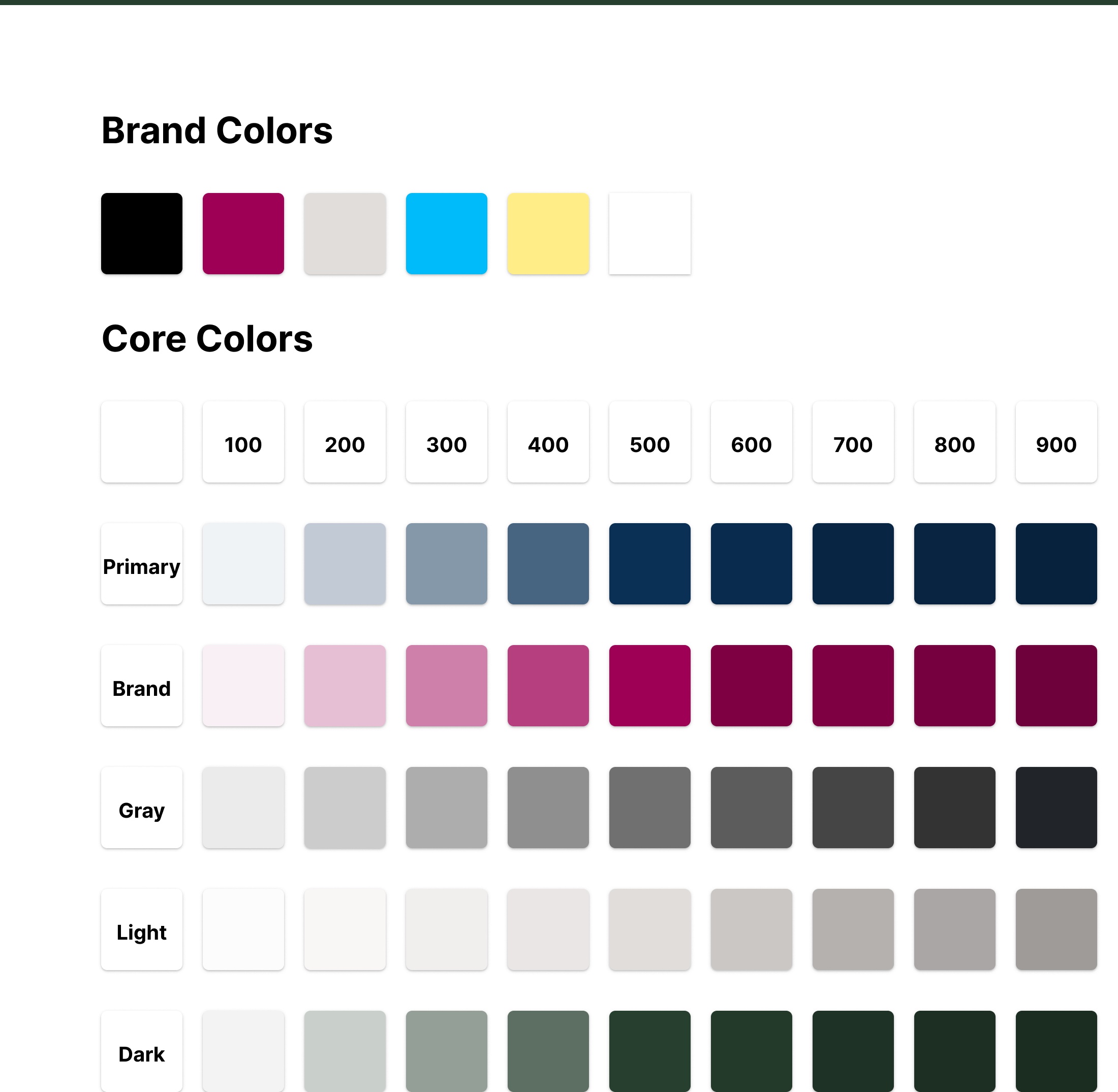
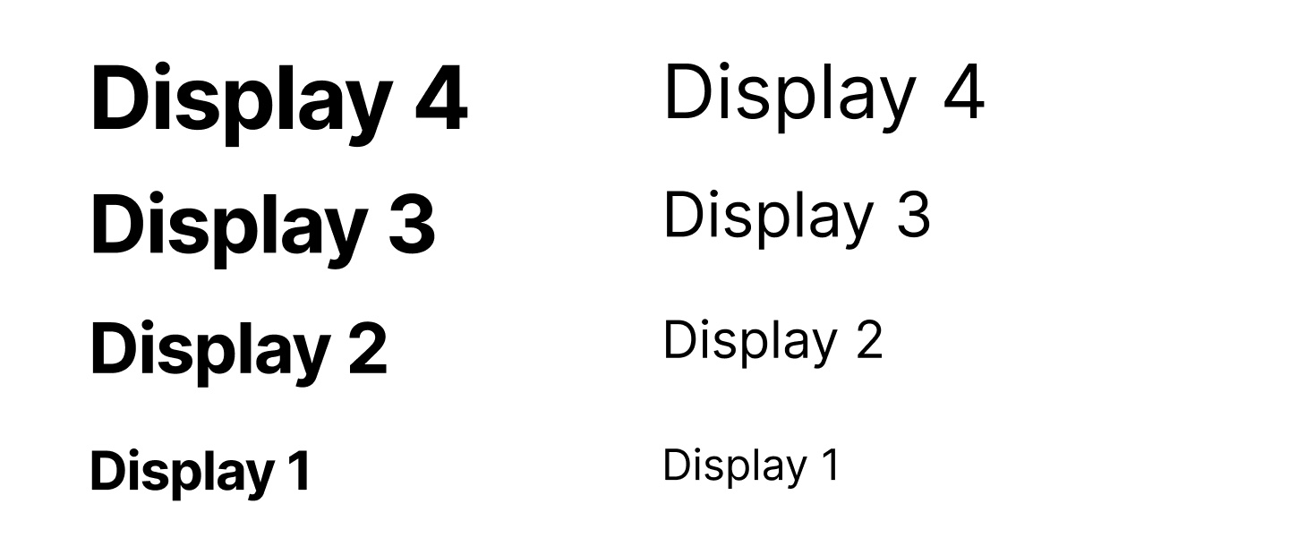
Part of the team that moved Open edX’s shared Figma libraries into one community-maintained instance. I remapped Paragon’s old color styles to variables, matching the live site exactly. I also migrated components into the new file, flagged React components missing from Figma, reported an accessibility issue upstream, and co-presented the project at the Open edX Conference.

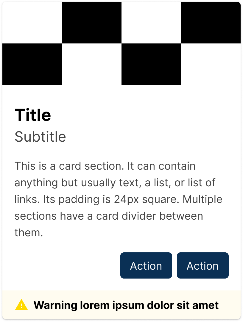
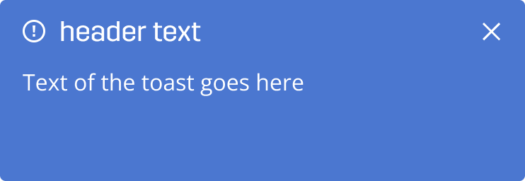
Paragon brand and core color scalesParagon display type scale in bold and regularParagon card componentParagon success alertParagon toast with an actionParagon search fieldParagon primary buttonParagon success badgeParagon progress bar

02 · A&E project-management tool

Figma System for A&E Software

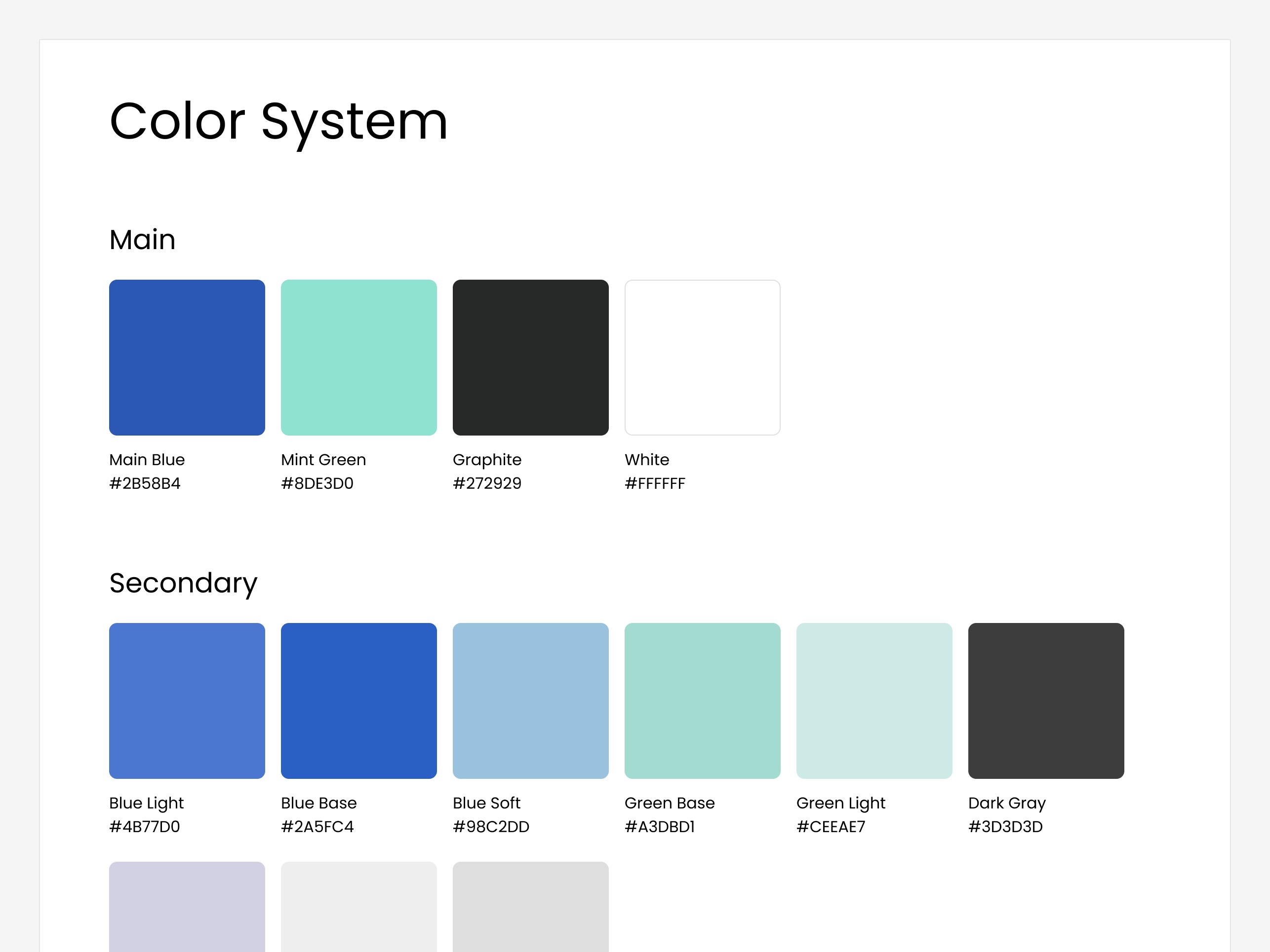
Contributed early foundation components and navigation explorations to a Figma design system for an architecture and engineering project-management tool. A senior designer led it. Their feedback on this project taught me to cut unnecessary variants and layers from a component system.

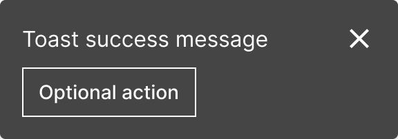
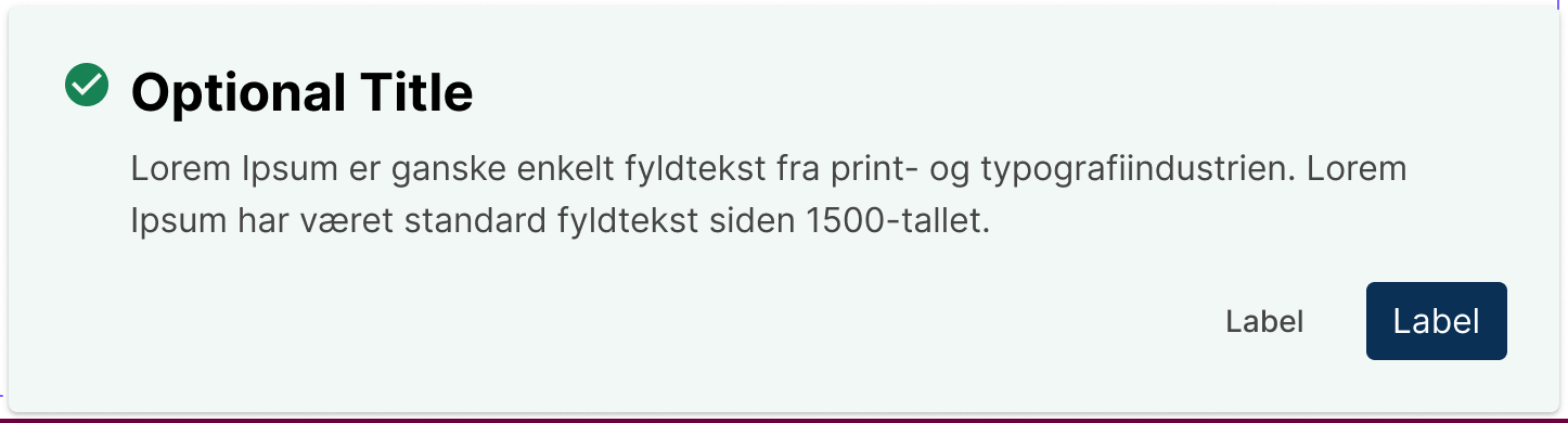
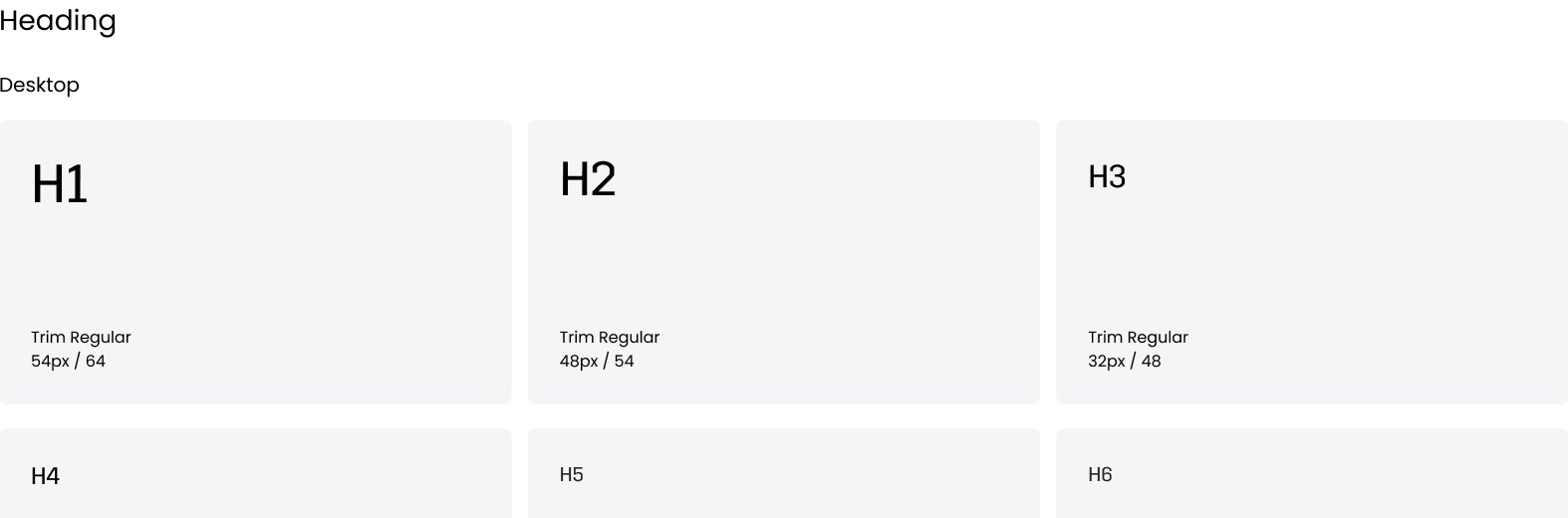
A&E tool color system: main and secondary swatchesA&E tool heading type scaleA&E tool toast notificationA&E tool data table with row actionsA&E tool primary buttonA&E tool status pillA&E tool chipA&E tool progress bar

03 · Spending Spotlight

Visual Language & Card System

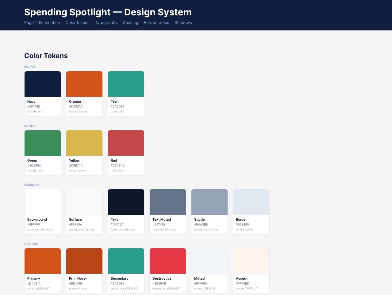
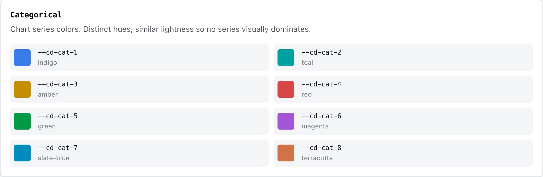
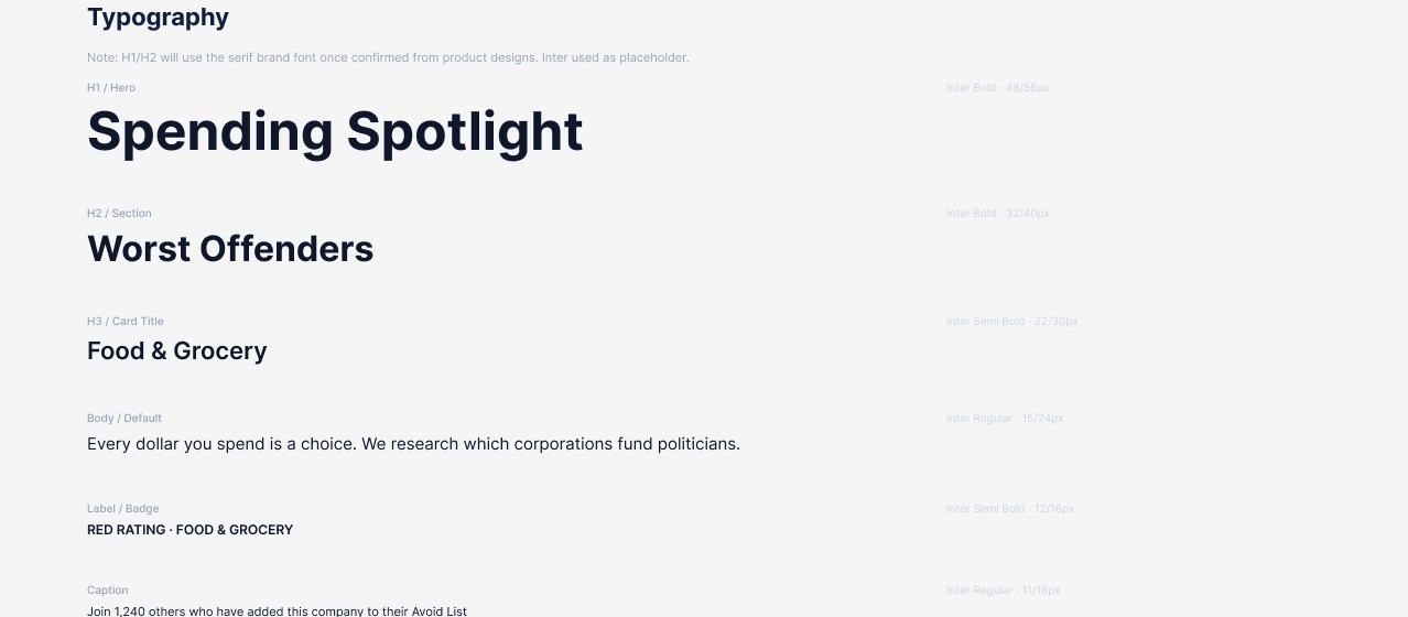
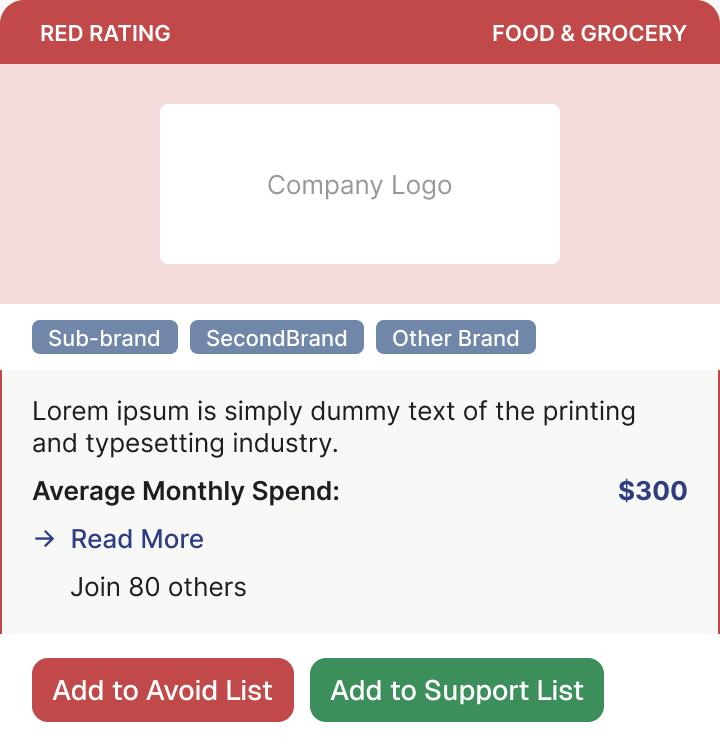
As the designer on an early-stage product, I explored three color palettes. The one we chose separates brand from action colors, keeps semantic rating colors, and adds chart colors. I also set a clean sans-serif type scale, and standardized the card system with a type taxonomy, content toggles, fixed padding, and line caps.

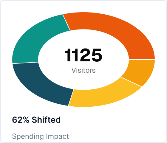
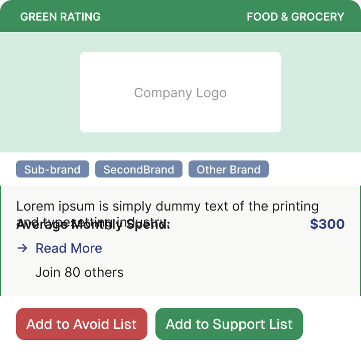
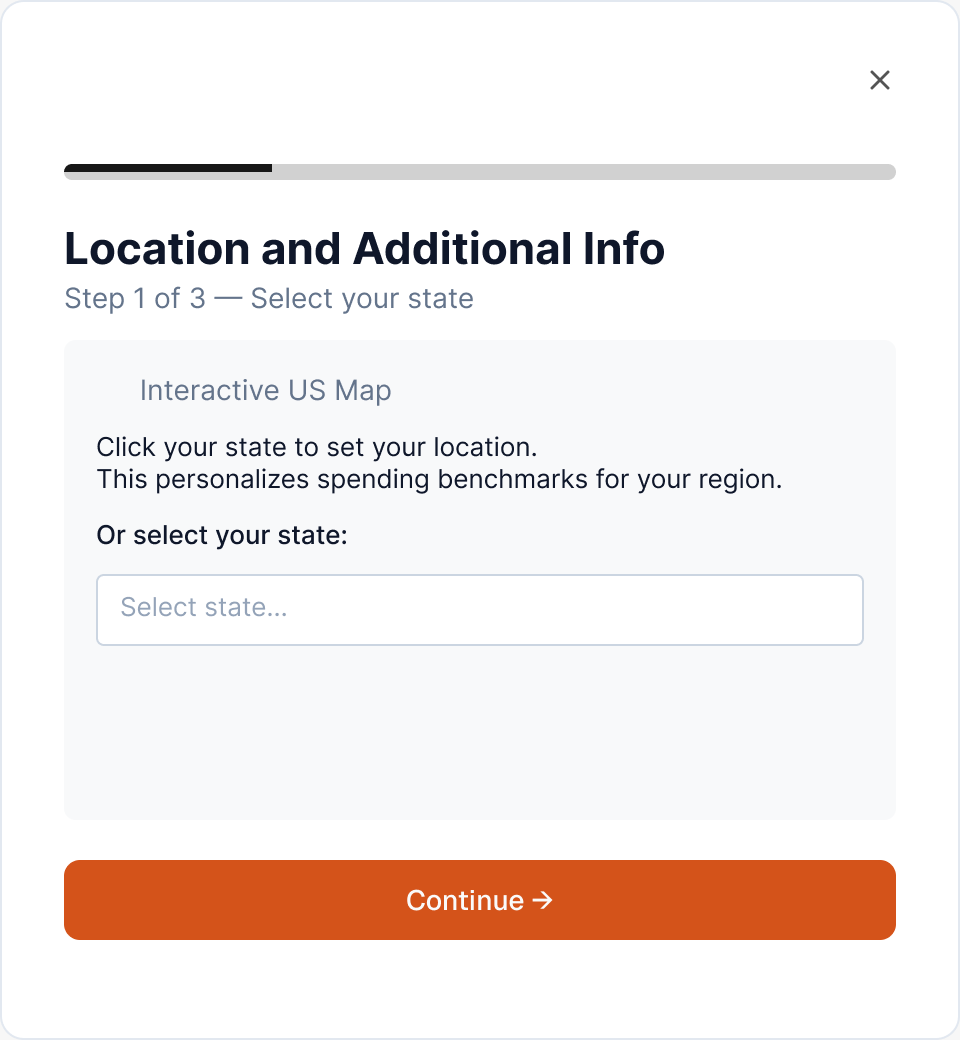
Spending Spotlight color tokens: brand, rating, semantic, and action colorsSpending Spotlight type scaleCompany card with a red ratingCompany card with a green ratingOnboarding modal, step oneSpending impact donut chartMonthly impact stat cardGreen rating badgeRed rating badge

What I Took Away

Tokens Are a Design Decision

Choosing a semantic token over a raw color is what lets a component survive a rebrand. I learned to make that call on every component.

Small Pieces Carry a System

Selection controls, status pills, and headers don’t look impressive, but their consistency is what makes dense screens feel coherent.