Mobile Work
Designing the native Open edX learning experience, and keeping the design source of truth behind it trustworthy.
- Role
- Product Designer
- Client
- Open edX (Axim Collaborative)
- Timeframe
- 2024 - 2026
- Tools
- Figma, Confluence, Notion
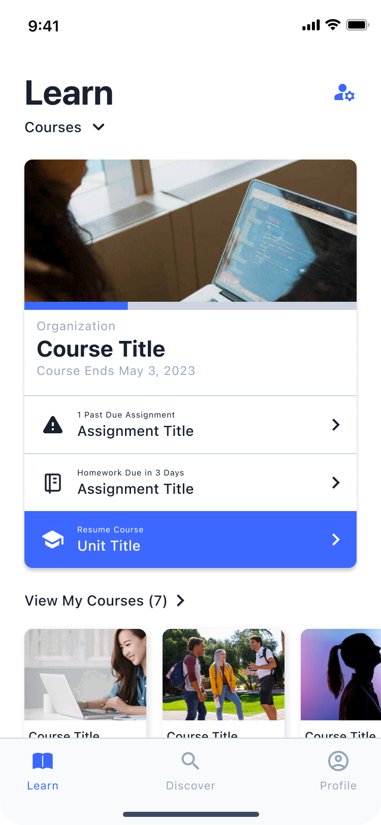
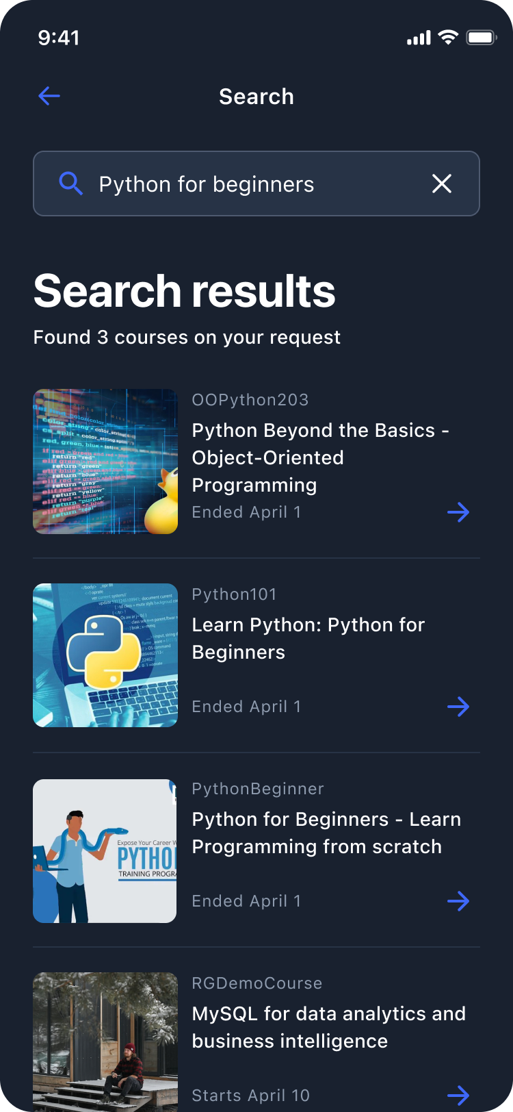
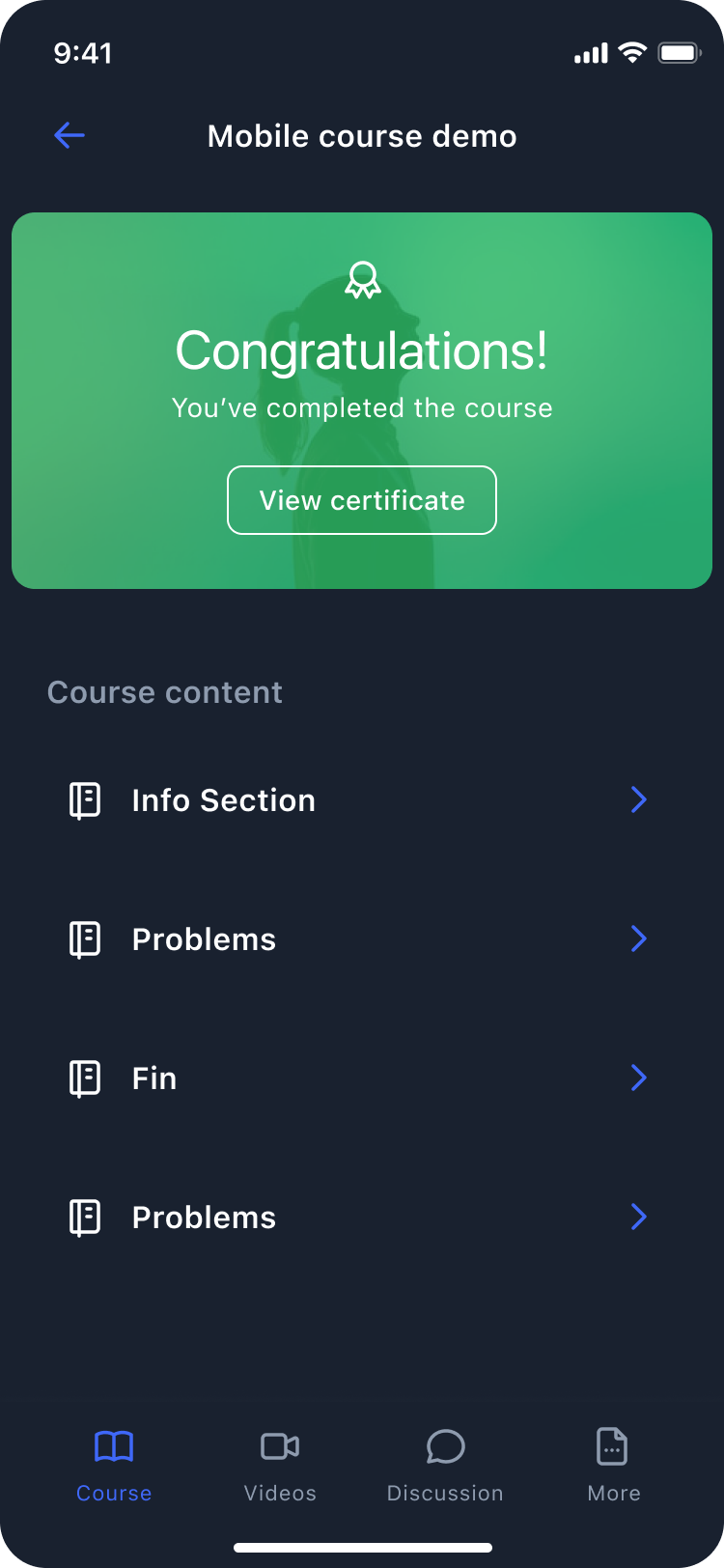
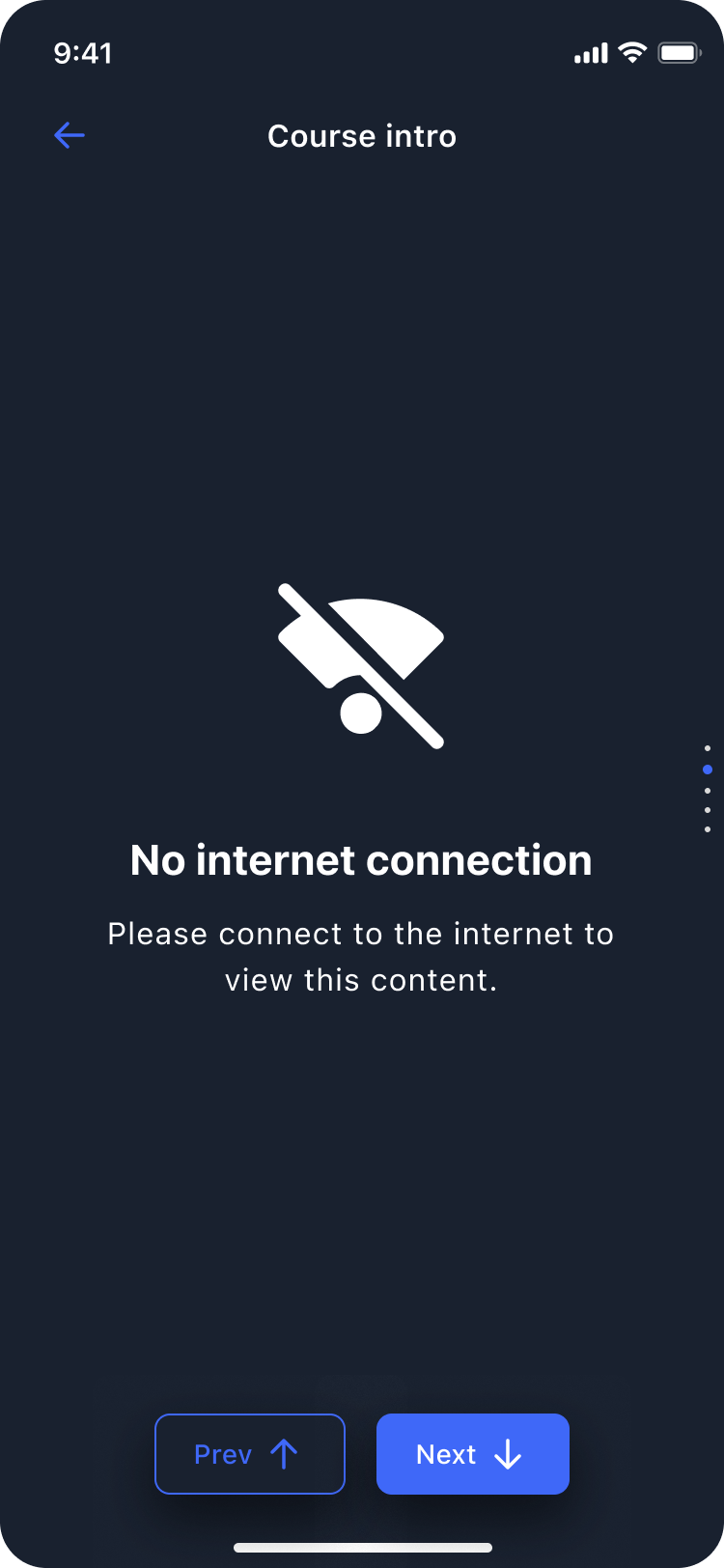

The Open edX Mobile App
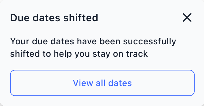
The Open edX mobile app is open source. Learners use it on iOS and Android, and several organizations build it together. Schema supports its roadmap through contributions funded by Axim, the nonprofit behind Open edX. Development partners implement the designs.
My work there grew in three directions: designing parts of the learning experience itself, keeping the shared design file accurate for everyone building the app, and working through the product models around it, like notifications.
Visual Course Progress
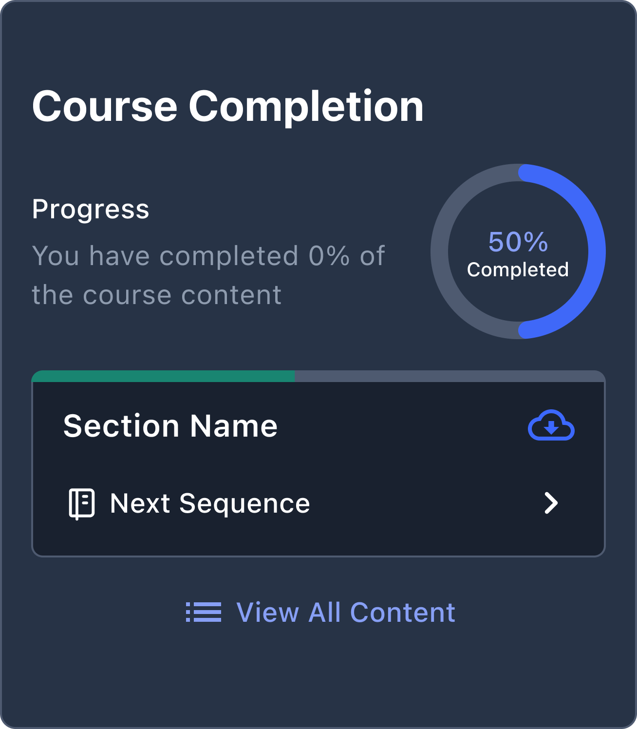
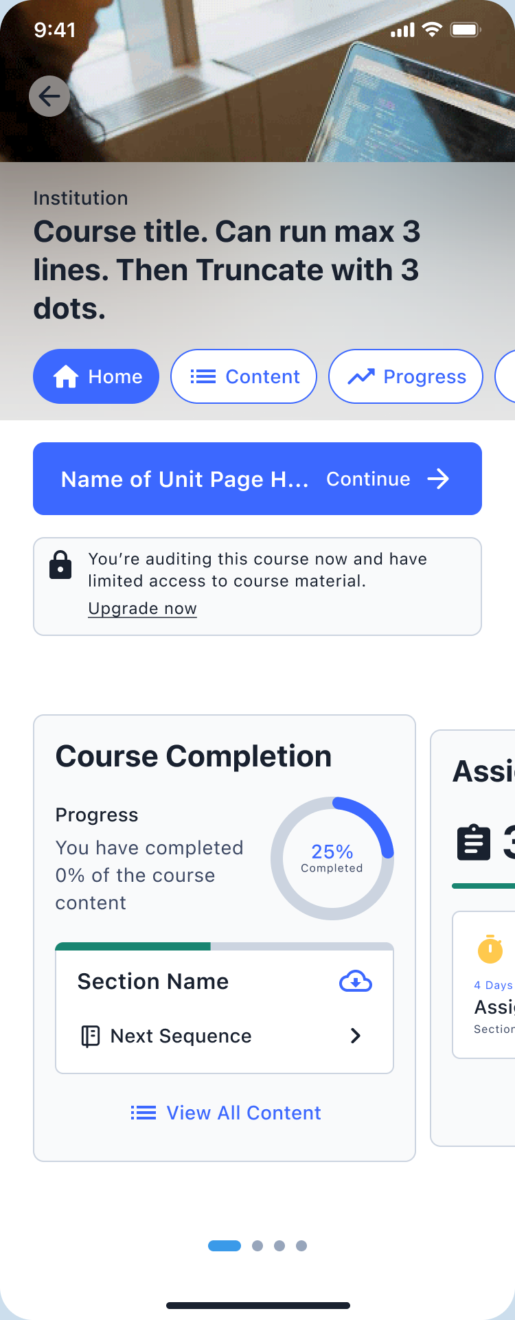
On the web, Open edX has a dedicated progress page. On mobile, progress was a thin bar and an “8 of 20 assignments” count. The project set out to bring richer progress into the native app and to use it to point learners toward what to do next.
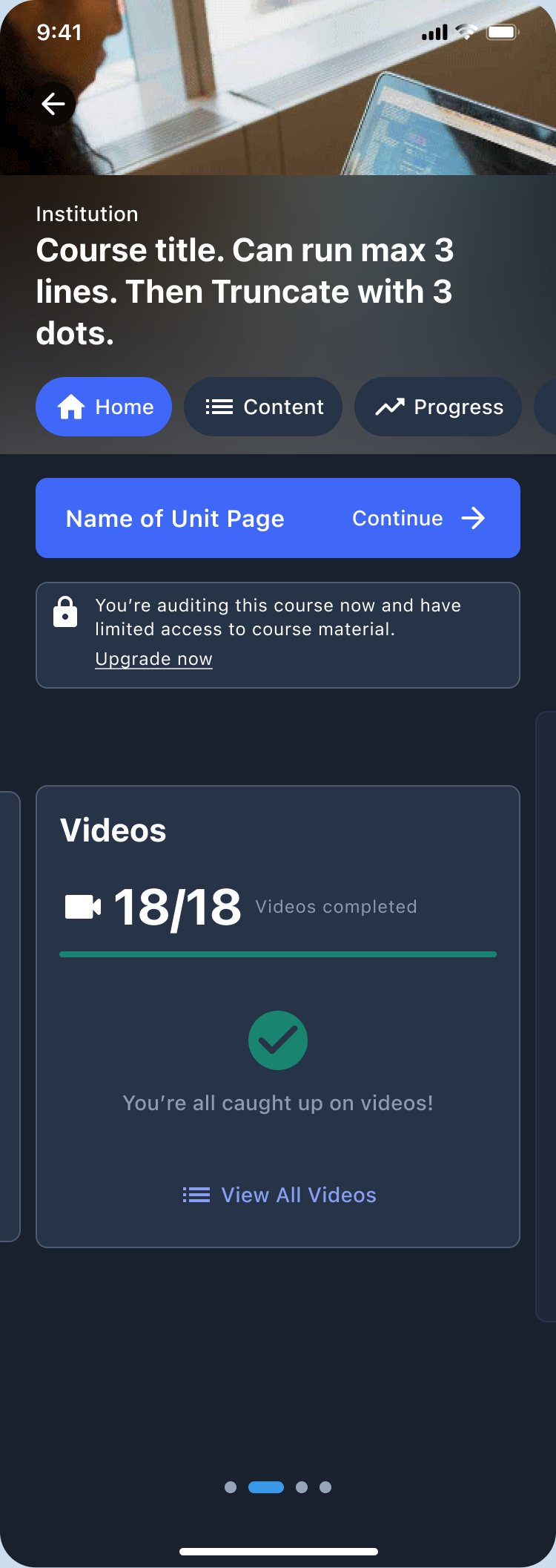
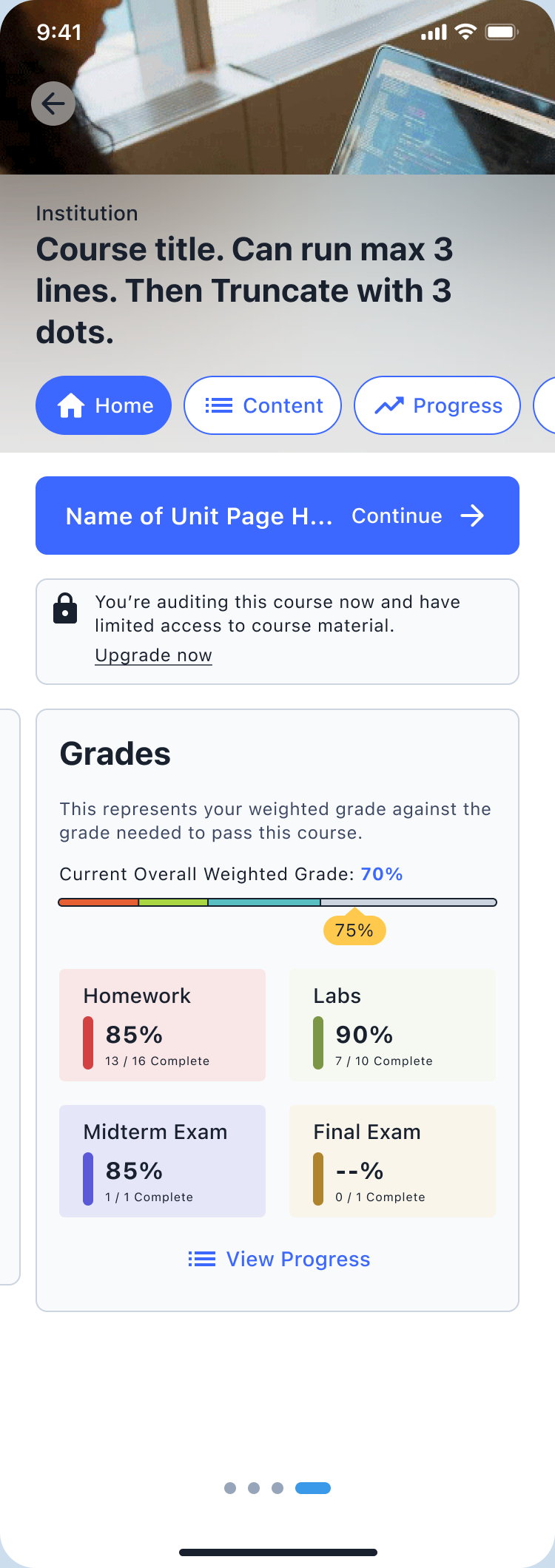
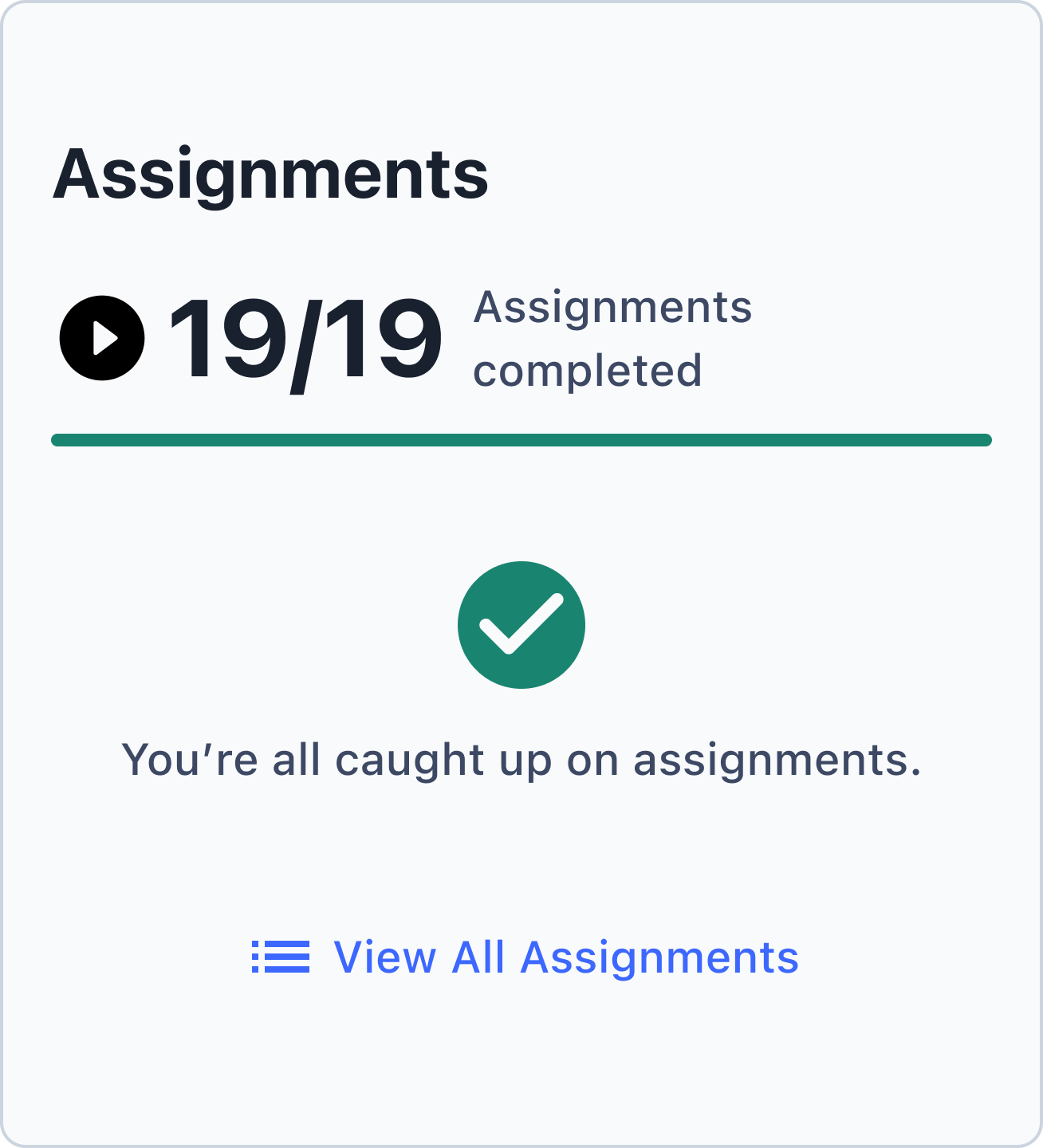
I designed the progress experience on a Schema team of two from late 2024 into early 2025, with a teammate supporting on design and product. I took the progress designs into high fidelity in light and dark themes, designed the states for zero, partial, and complete progress, and designed the cards that connect progress to action. As I designed each screen, I kept the full interaction workflow in mind, and flagged edge cases and gaps in the proposed flows, like whether a CTA should open a single assignment or the whole assignments view. I brought the work to internal Schema reviews and to the Open edX community’s mobile working group regularly, and iterated on it from their feedback.
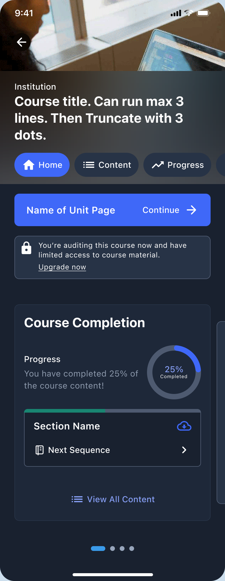
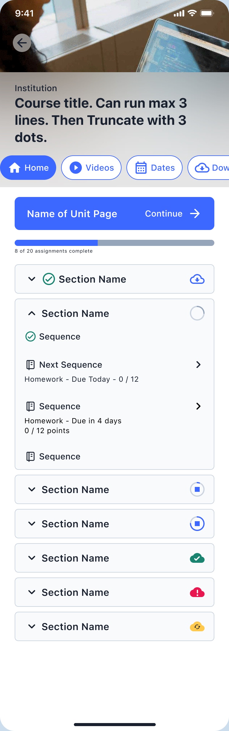
Course home
Mini Progress Widgets
Compact progress on the course home, with states for completed, in progress, upcoming, and not yet started.
Next action
CTA Cards
Cards that send learners to the assignment, video, or grade they need next, with variants like due soon, past due, continue watching, and all caught up. I dropped an expand/collapse version to avoid cognitive overload.
Video
Video Progress Cards
Building on the team’s course content cards, I explored thumbnail orientation, border treatments, completion icons, and duration labels so learners can see where they left off.
Modes
Progress That Fits the Goal
Completion, weighted grade, assignments, and video progress, so the view can follow what a learner is actually trying to achieve.
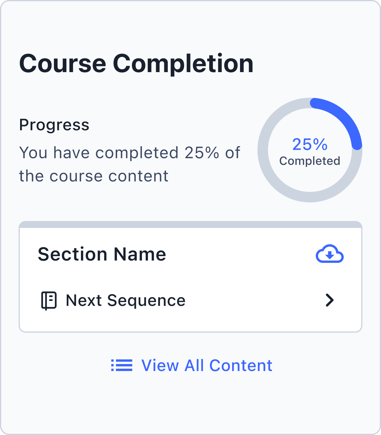
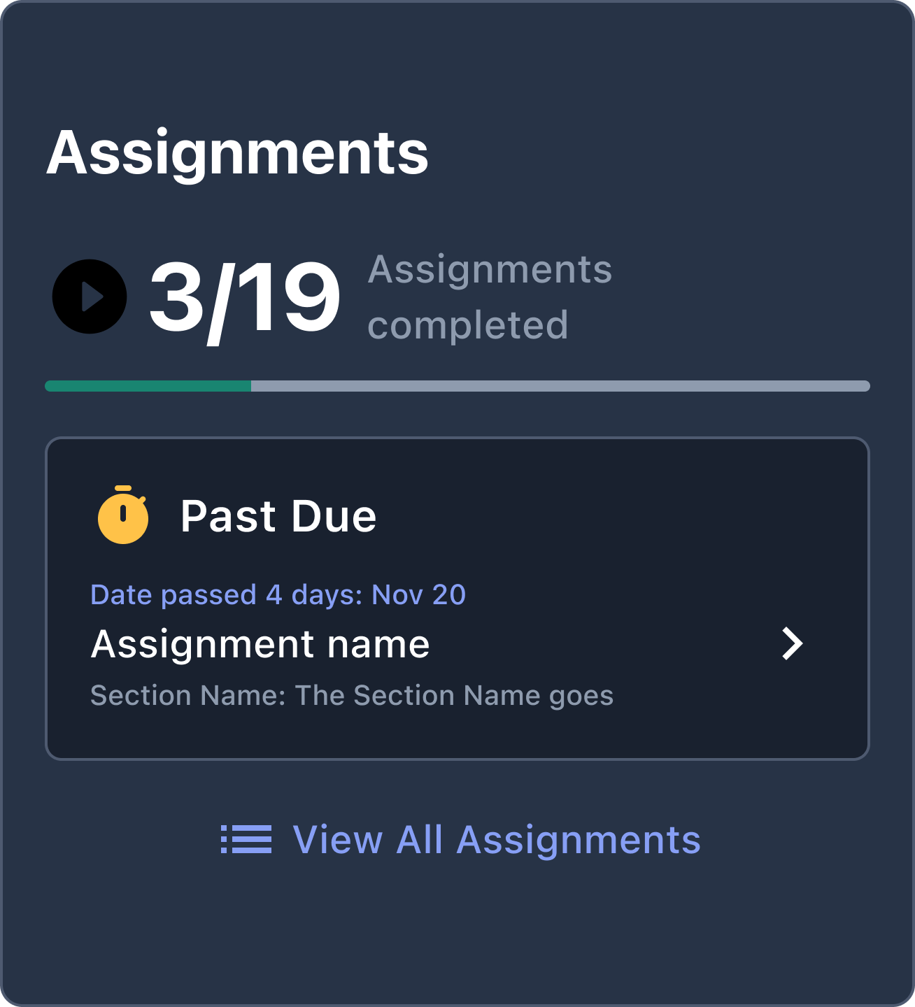
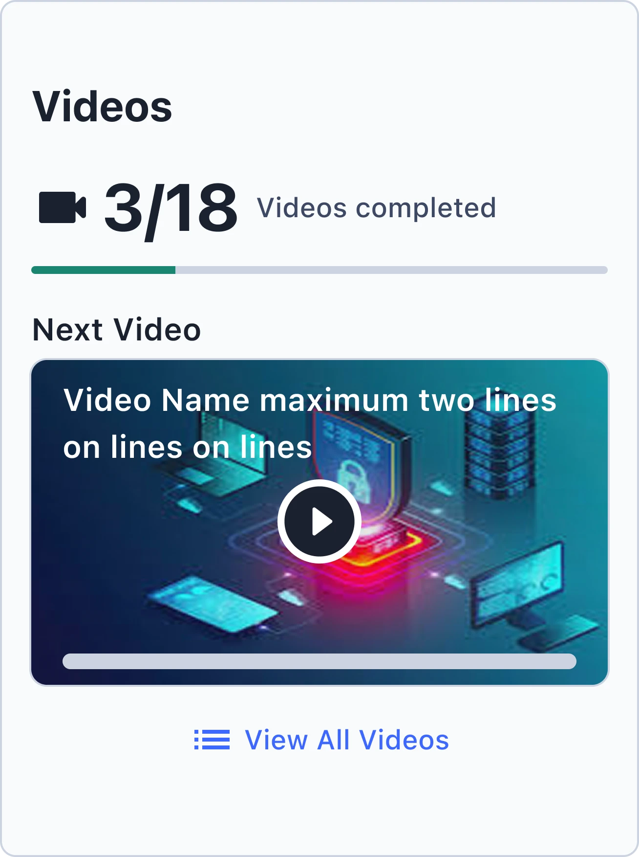
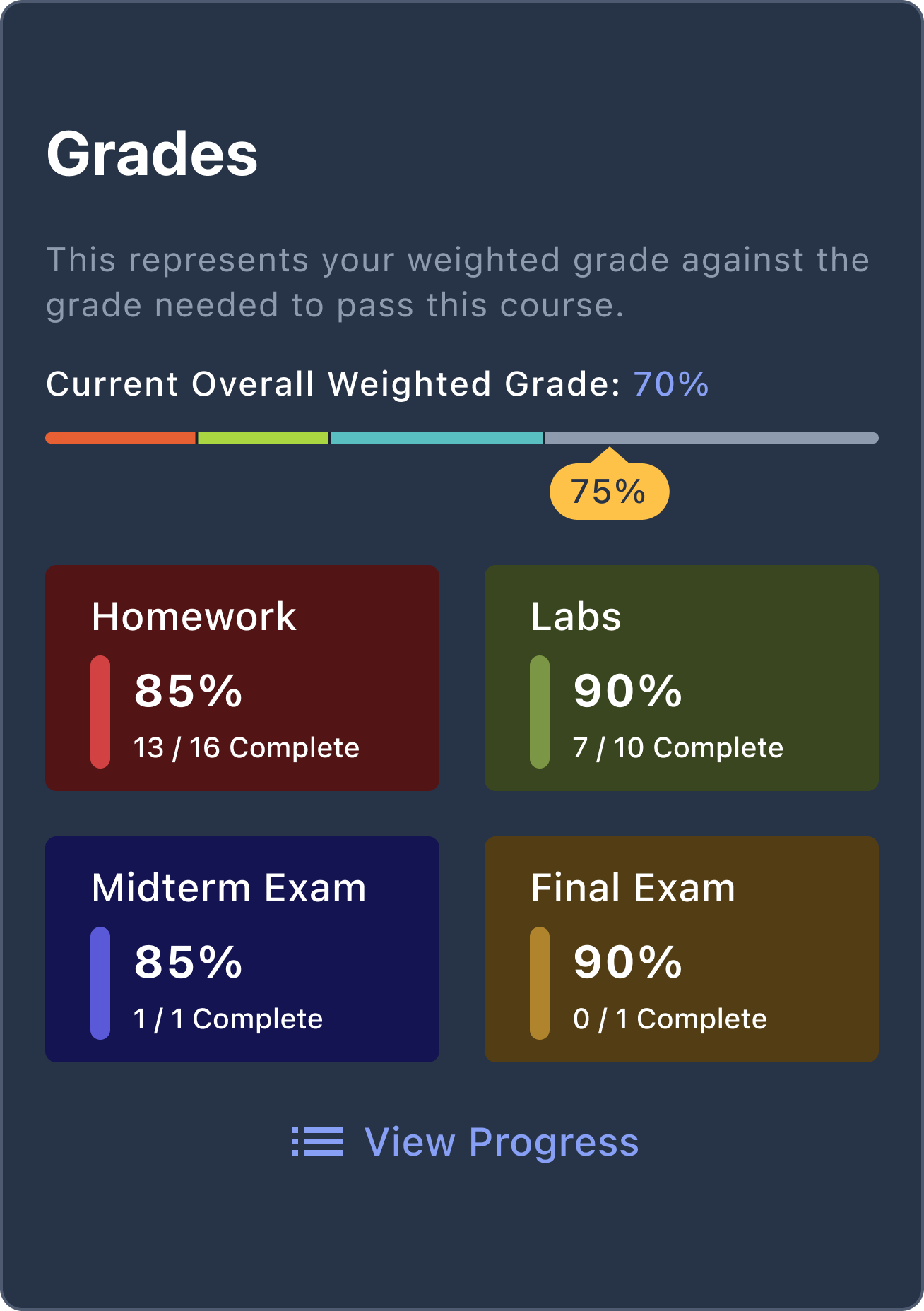
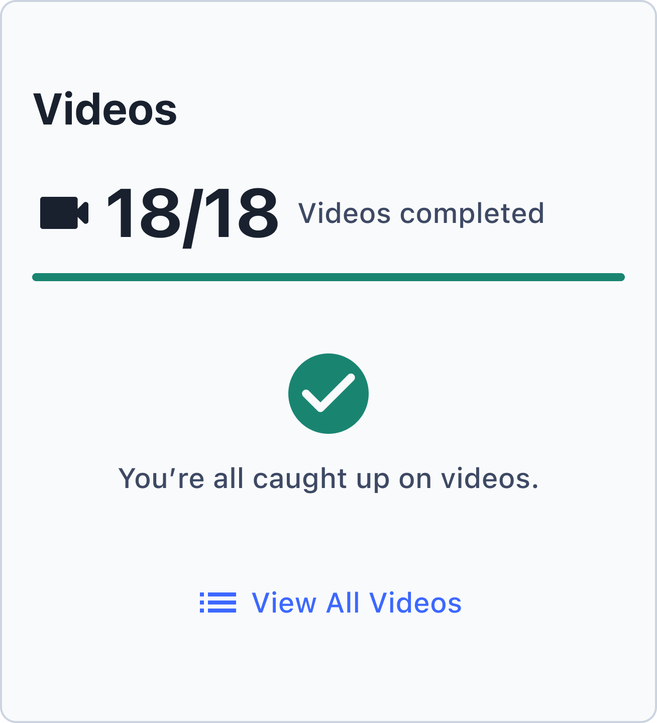
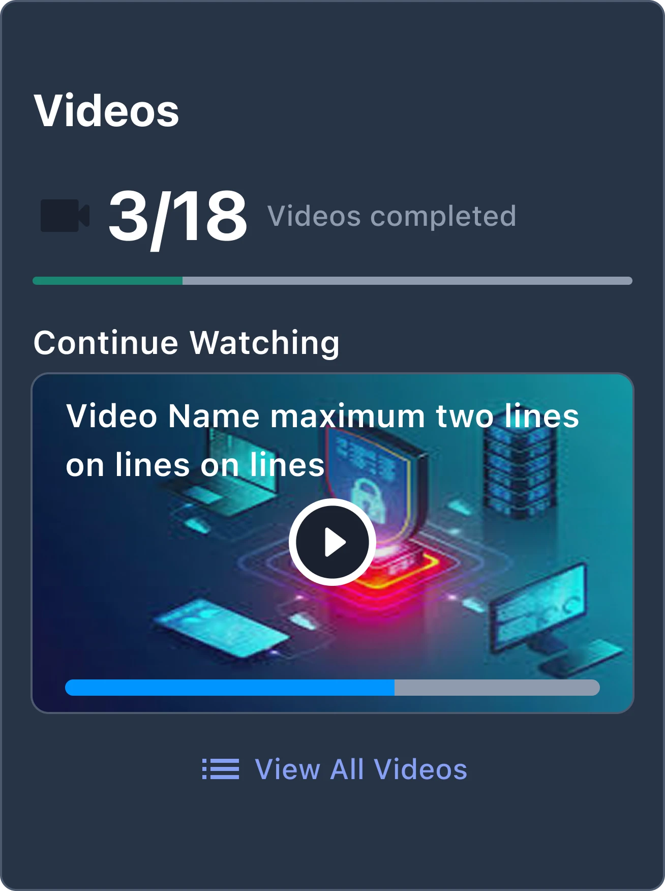
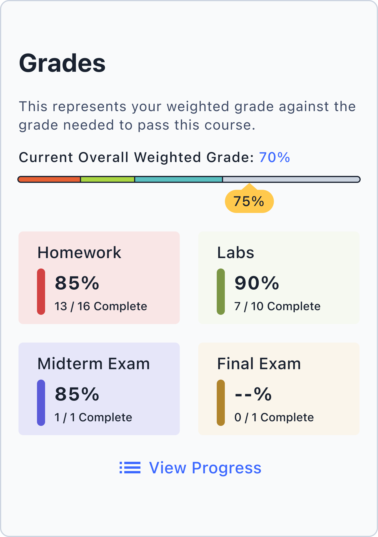
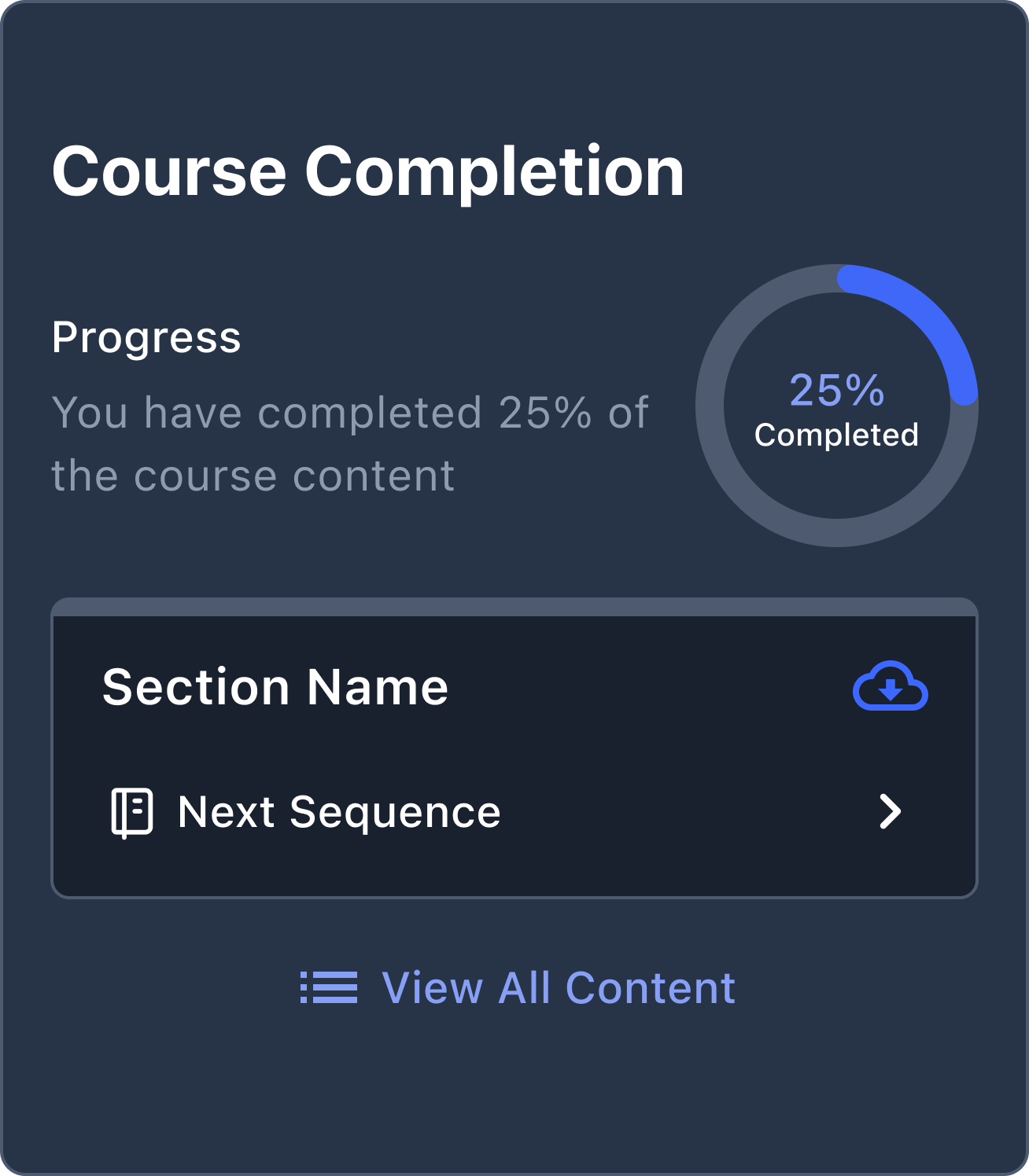
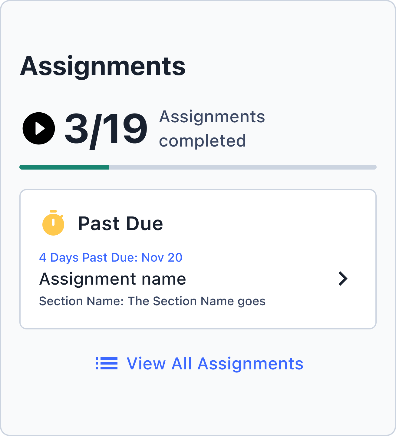
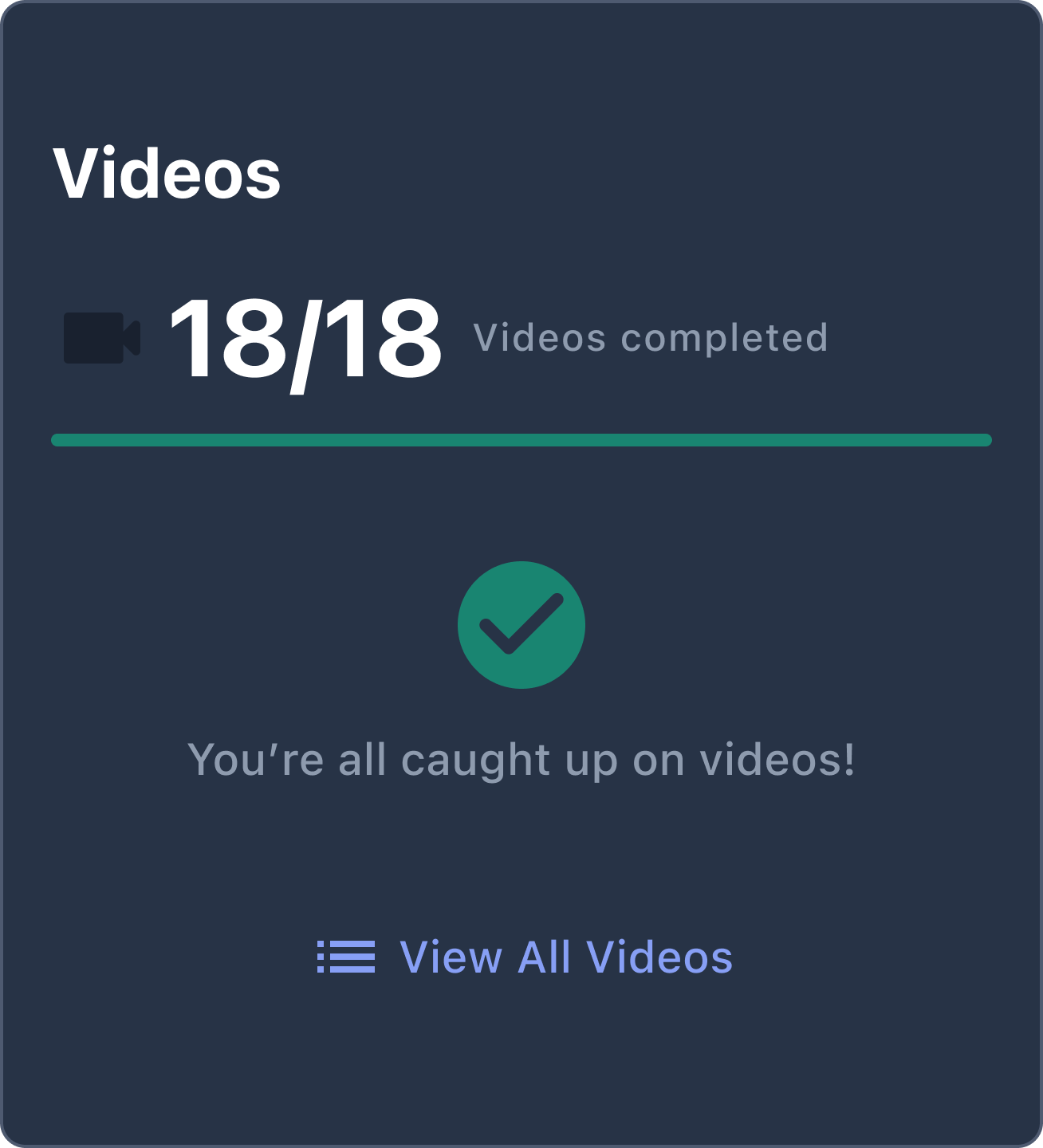
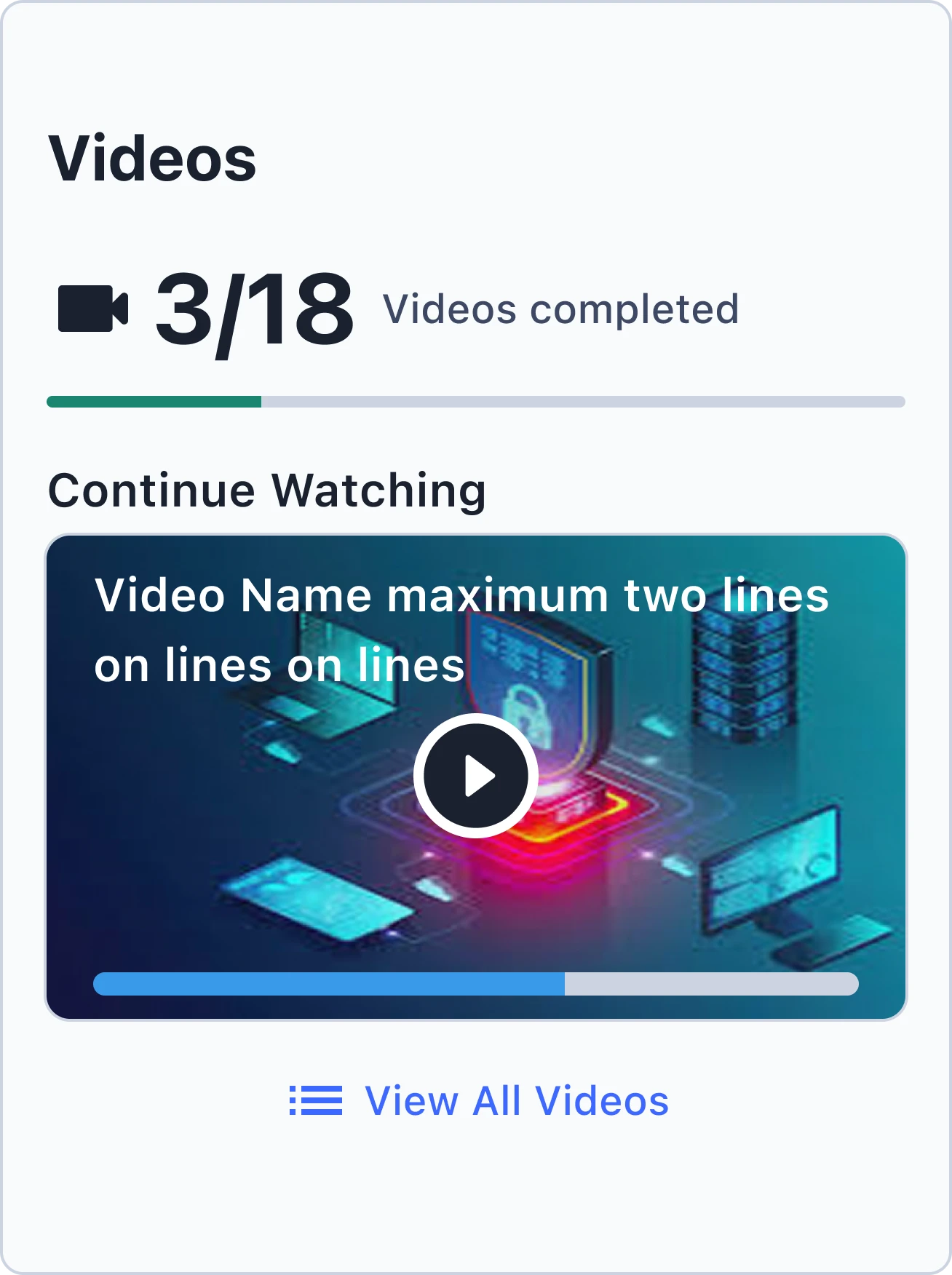
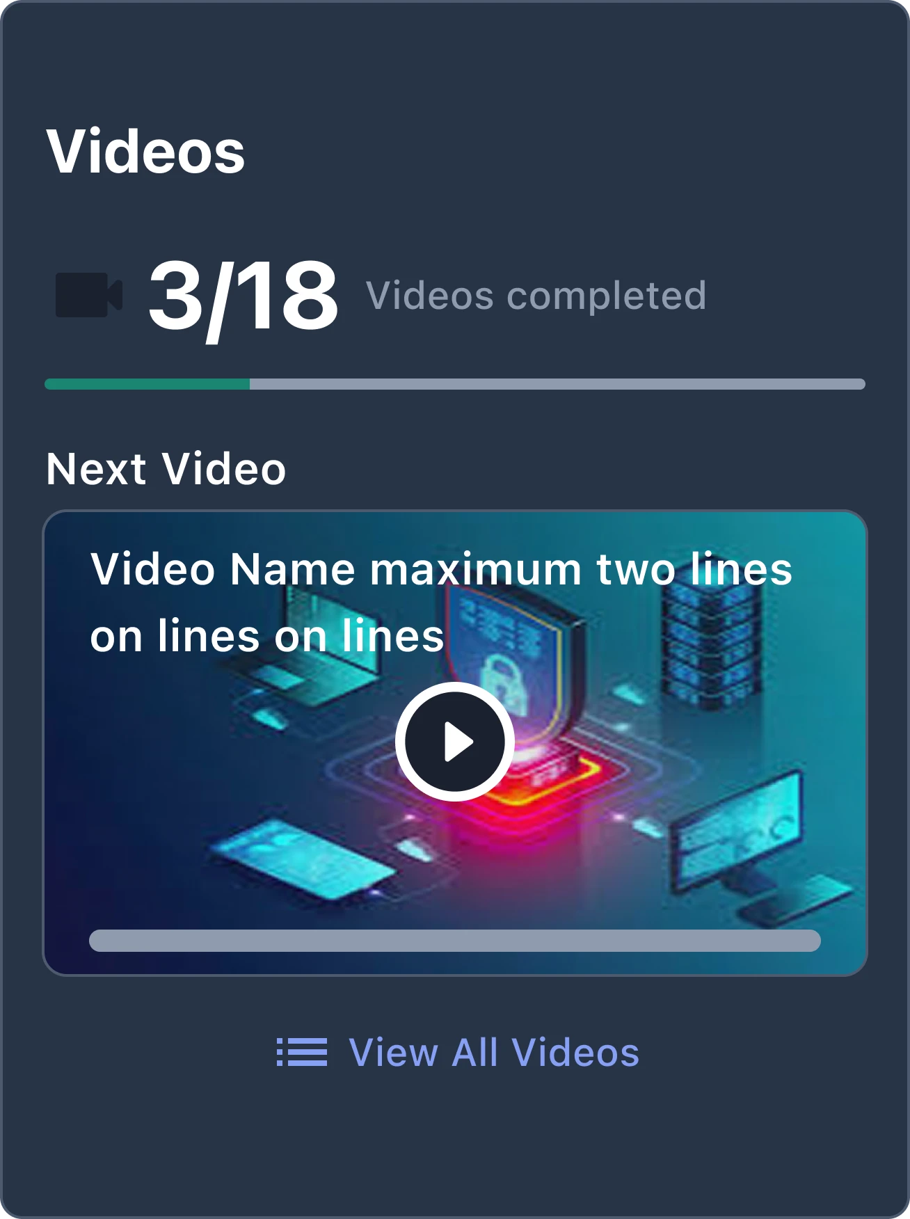
A progress bar is only useful if it helps learners decide what to do next.
Keeping the Design File Trustworthy
All contributors share one community Figma file, but it had drifted from the app. Shipped screens sat next to abandoned proposals, and staging builds, released builds, and partner implementations didn’t always match. From mid-2025 through mid-2026 I owned Schema’s mobile Figma support project, and I spent about 60 hours making the file an accurate picture of the app again.
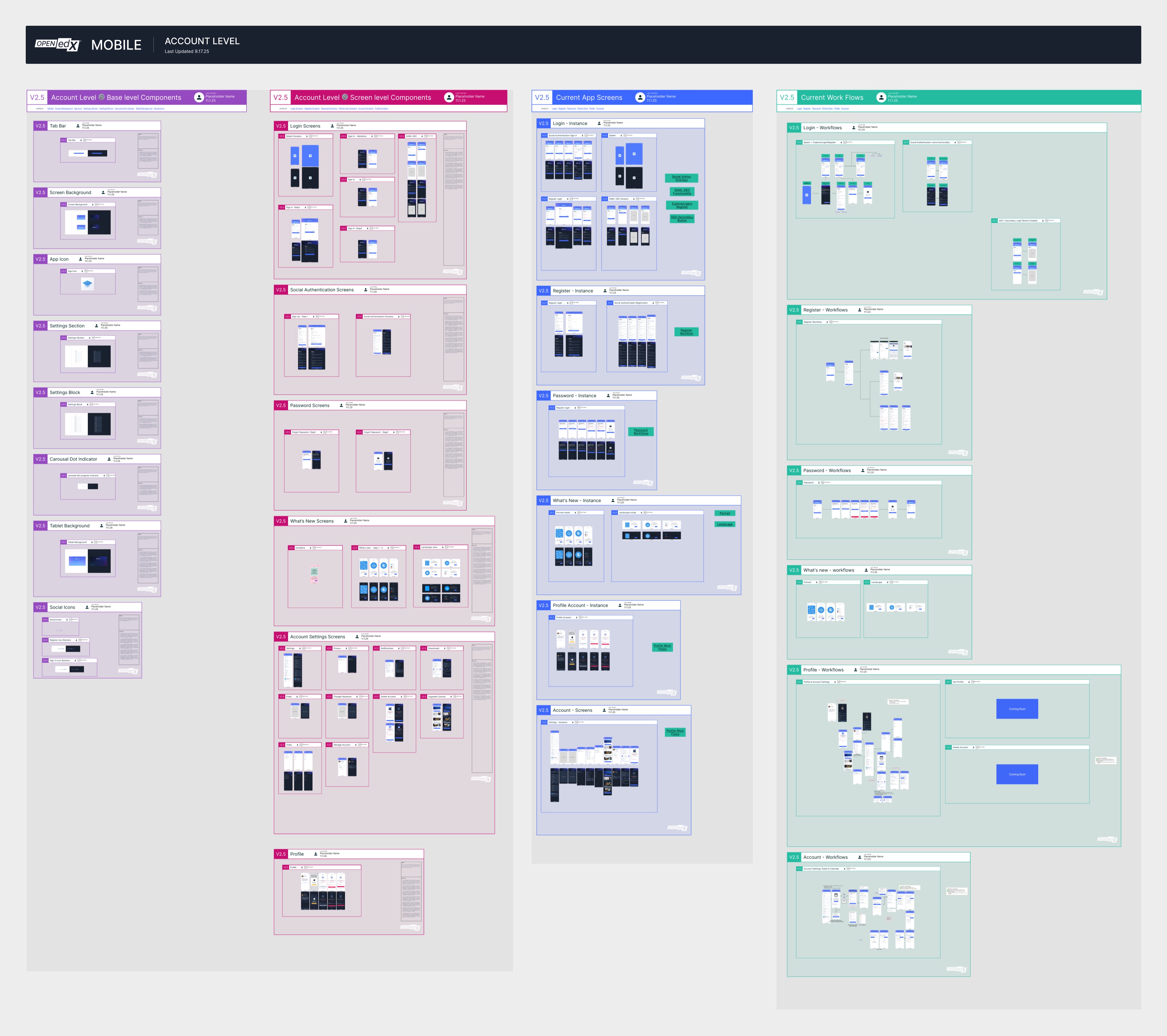
Current vs. proposed
Level Pages Show What Ships
Each level page (app, course, account) documents only the screens in the live app. Proposals moved to their own project pages.
Validation
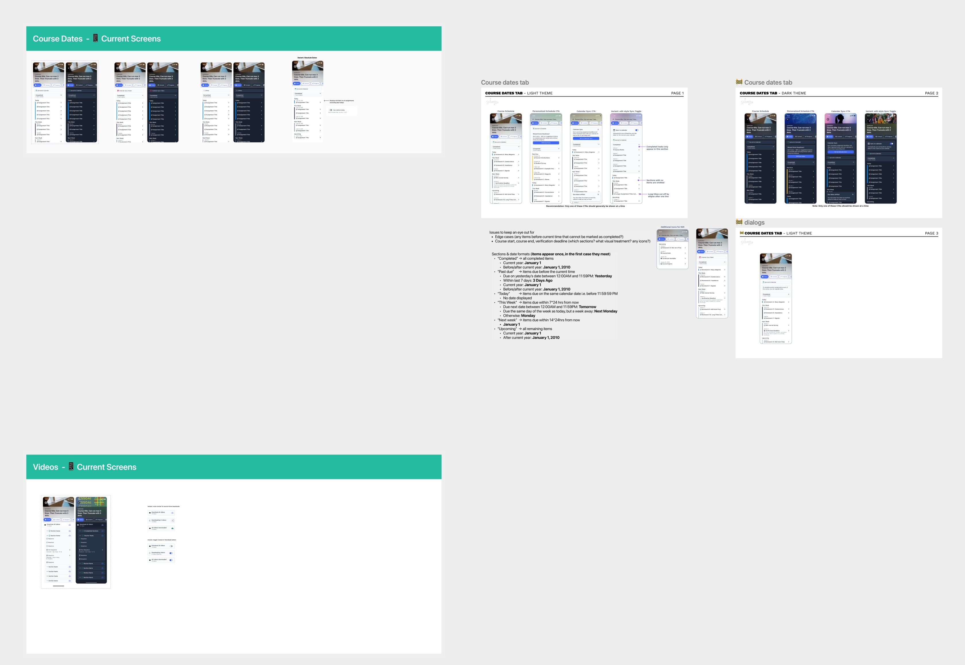
Checked Against Real Builds
I reviewed the current app builds and updated Figma to match, including a course level that now reflects the new content view.
Structure
Templates, Components, Color
A shared project template, a unified set of shared components, and named color variables in place of loose hex values.
Versioning
Versioned Releases
I created v2.5 of the file and archived v2.4, which made room for bigger cleanup without losing the design history.
Before
Drag to compare
Designing the System Around the Screens
Some of my most useful mobile work was about the product model more than any single screen. The questions were what a notification belongs to, what an educator needs to know, and how a learner moves through content.
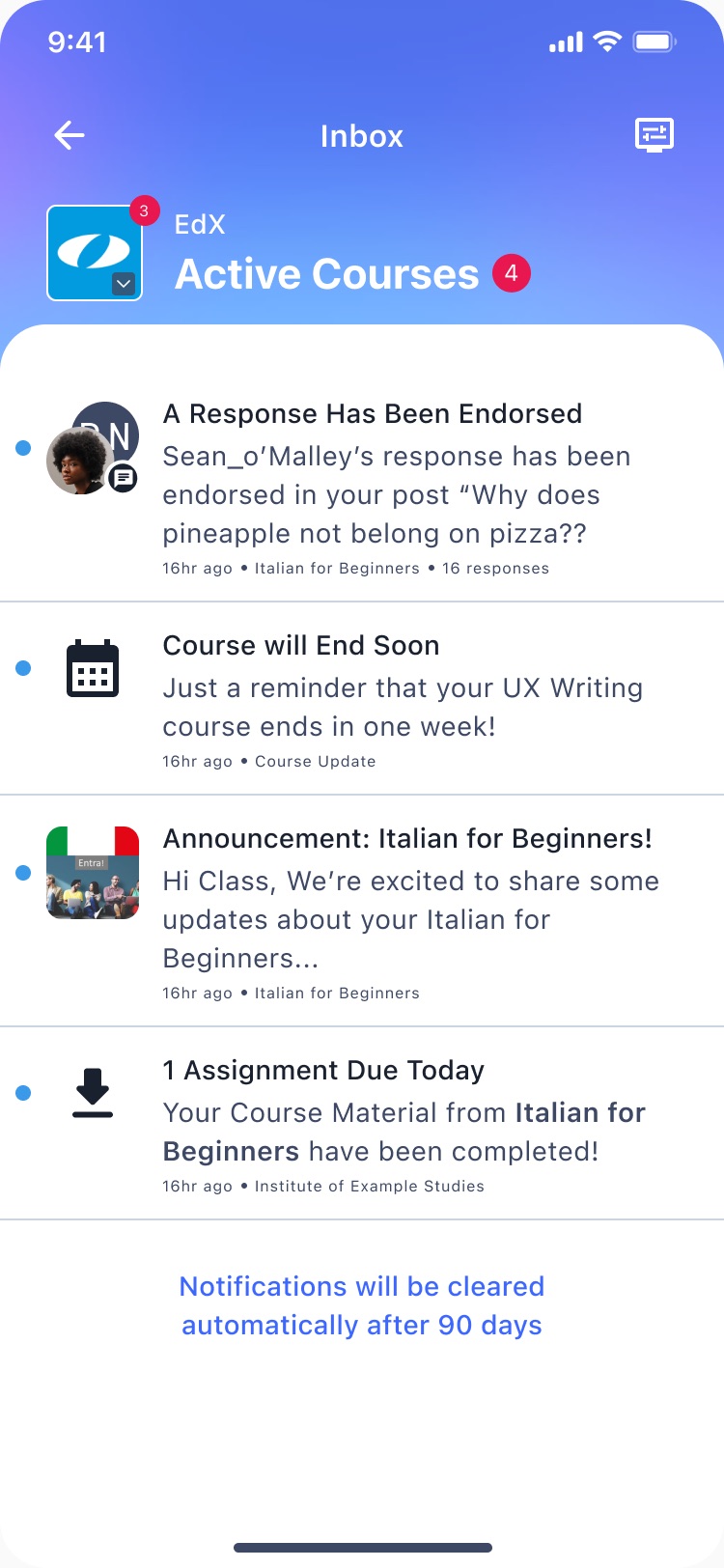
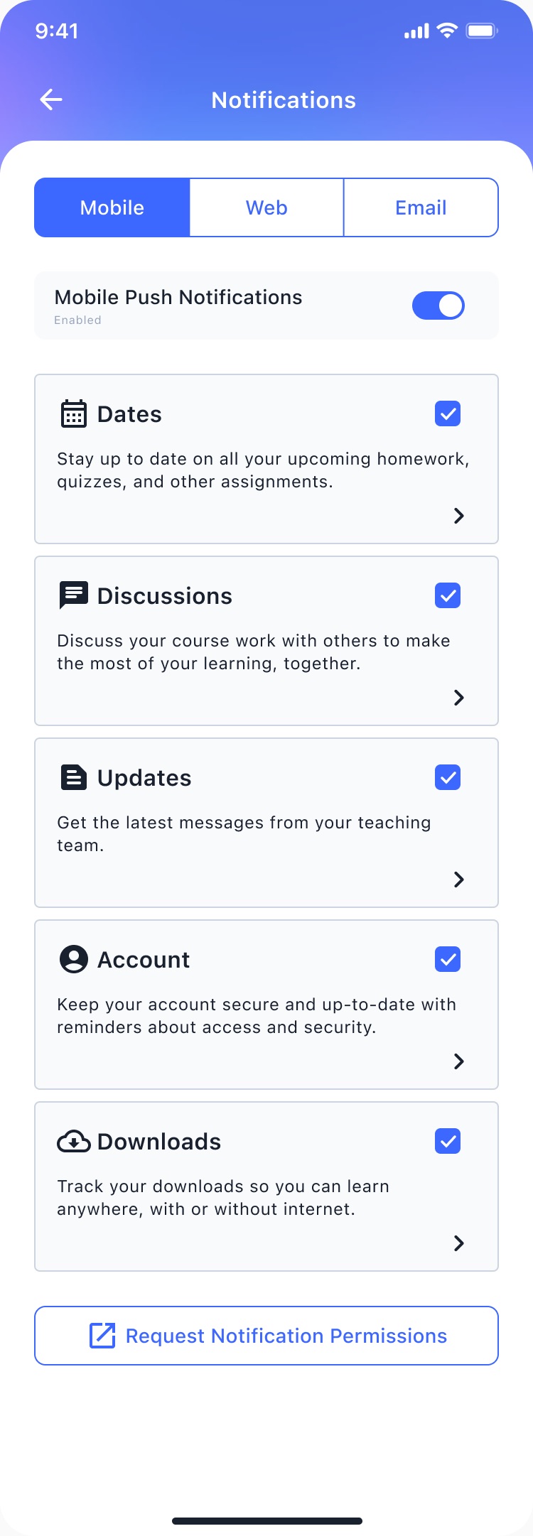
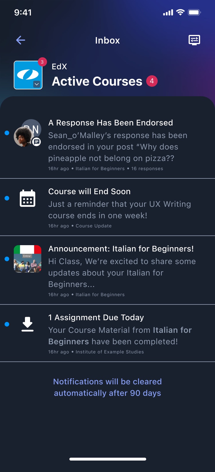
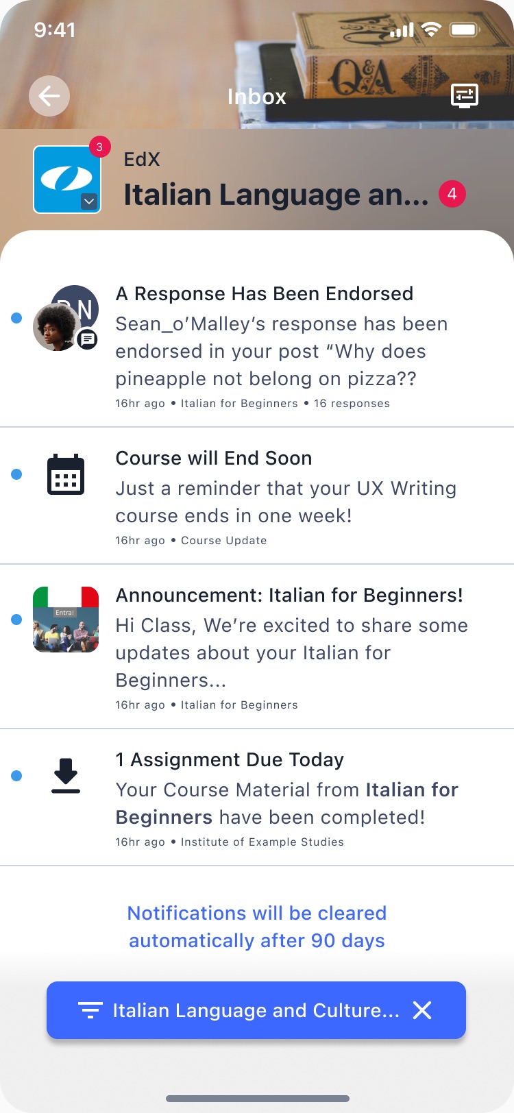
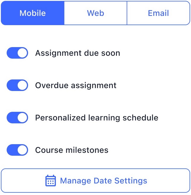
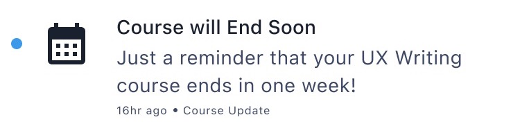
Notifications
A Model Before a Layout
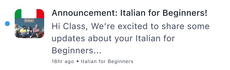
I explored per-course notification settings, header styles, categories with counts, and the difference between unseen and unread. Then I documented the notification types and flows in Confluence.
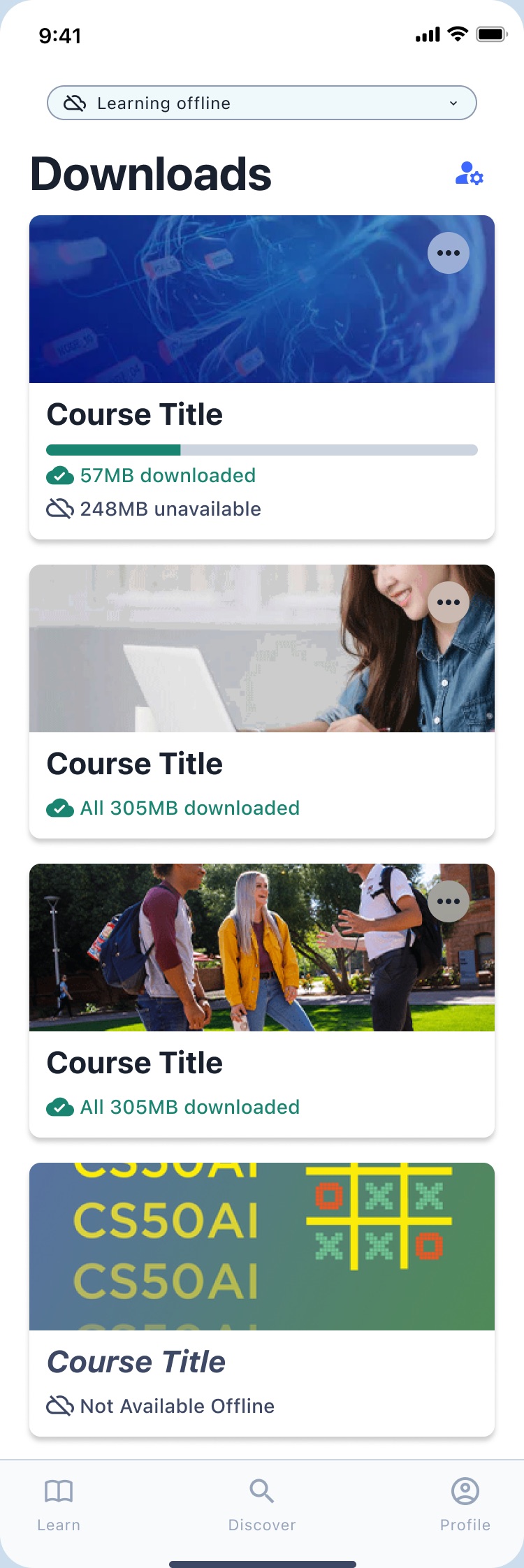
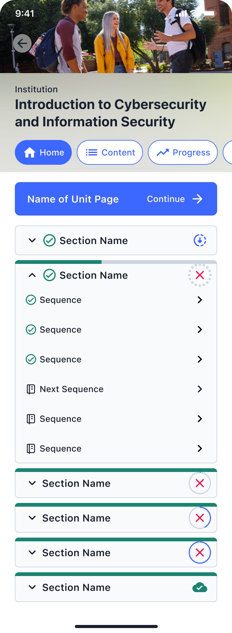
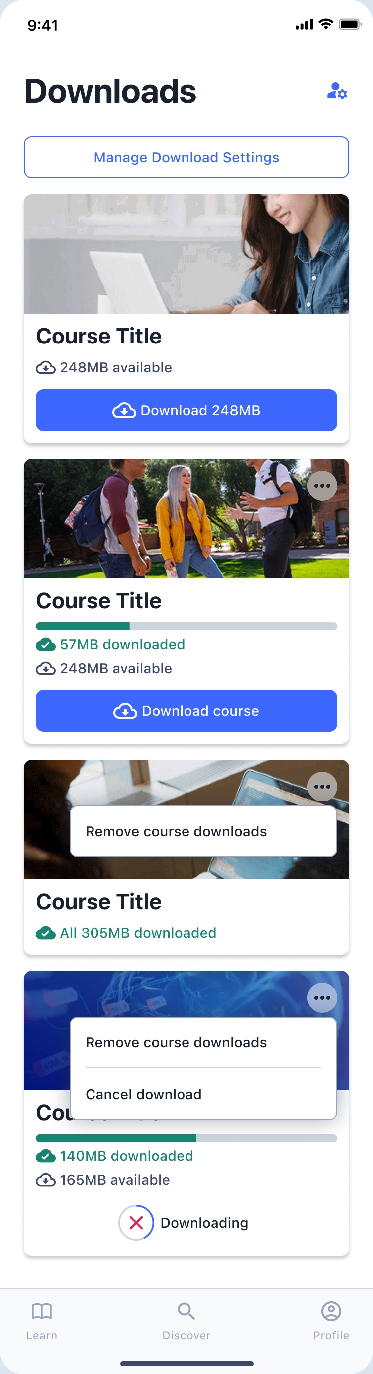
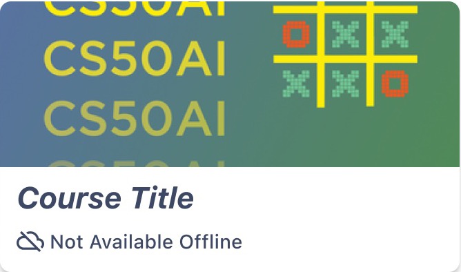
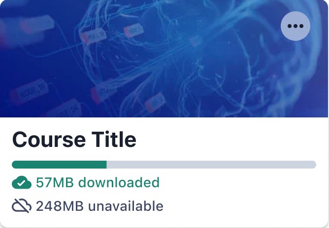
Offline
Offline Status and Sync
I explored offline status indicators, pending-sync and outdated-content messages, and download icons for learners studying without a connection.
Educators
Mobile Visibility in Studio
I prepared concepts to show educators how much of their course works on mobile, such as support indicators on content blocks and a mobile-readiness checklist.
Navigation
Beyond Next and Previous
I researched continuous-scroll patterns from webtoon apps and bento-style layouts, to rethink how learners move through a sequence of course content.

Helping Run a Distributed Design Practice
In early 2026 I co-led Schema’s part of the community mobile design meetings, where designers from several Open edX providers review contributions to the app. I planned agendas, triaged the file’s project pages (what to merge into the main screens, what to archive, what to move to its own file), and kept the cleanup work visible to the community it was for.
What I Took Away
A File Is a Product
A shared design file has users too, and it only works if they can trust that it matches the app.
Concept Before Pixels
With notifications, I learned to settle the model (nesting, actions, read state) before generating UI variations.